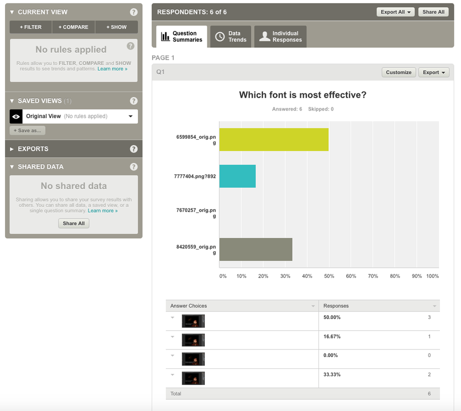
| final_ad_cracks_letgo.jpg |
| finished_ad_scars_letgo.jpg |
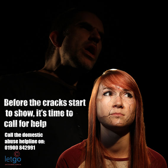
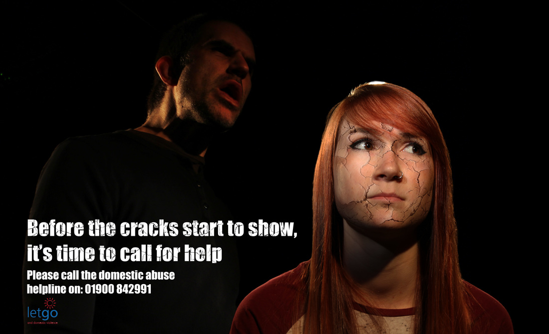
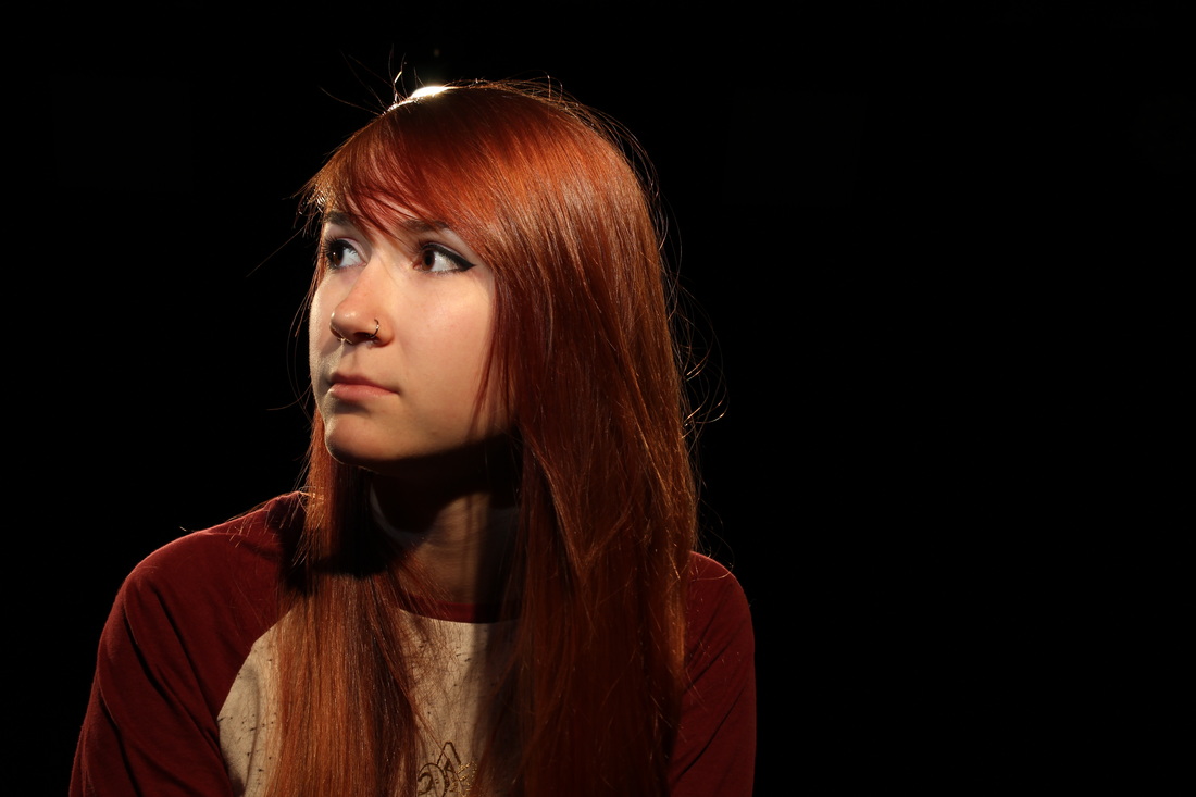
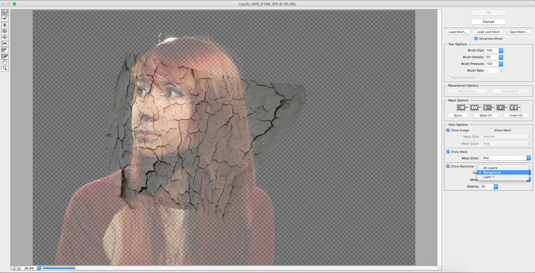
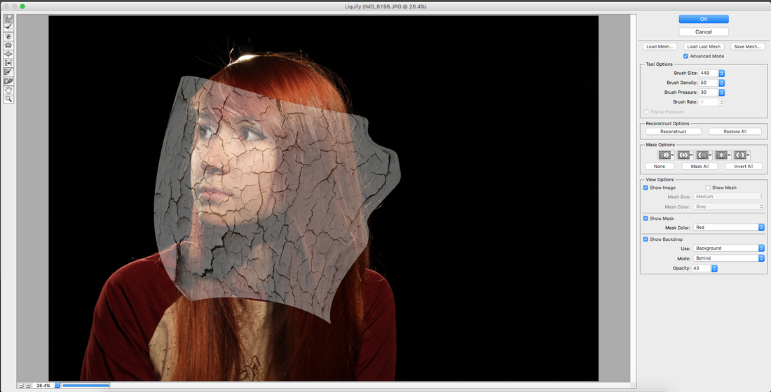
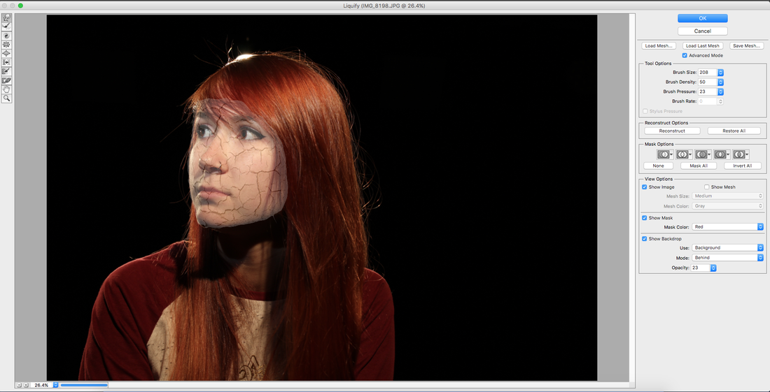
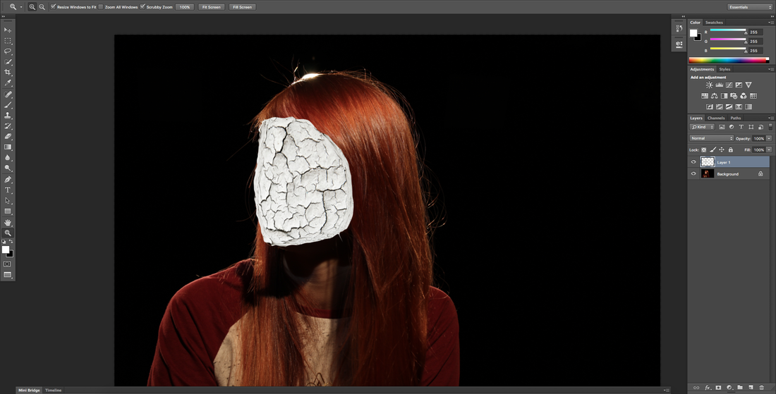
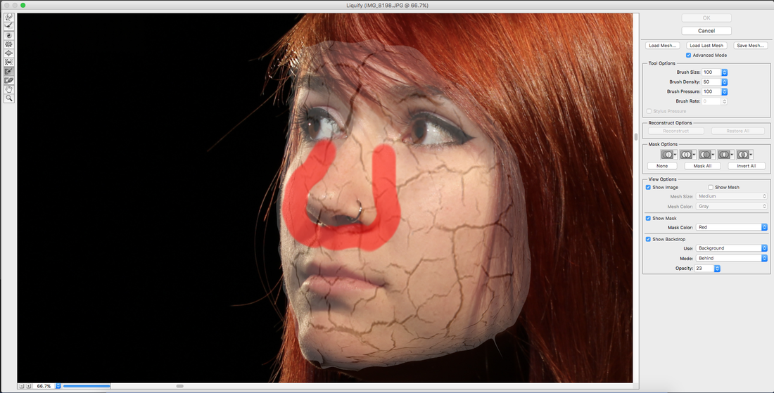
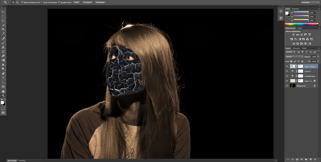
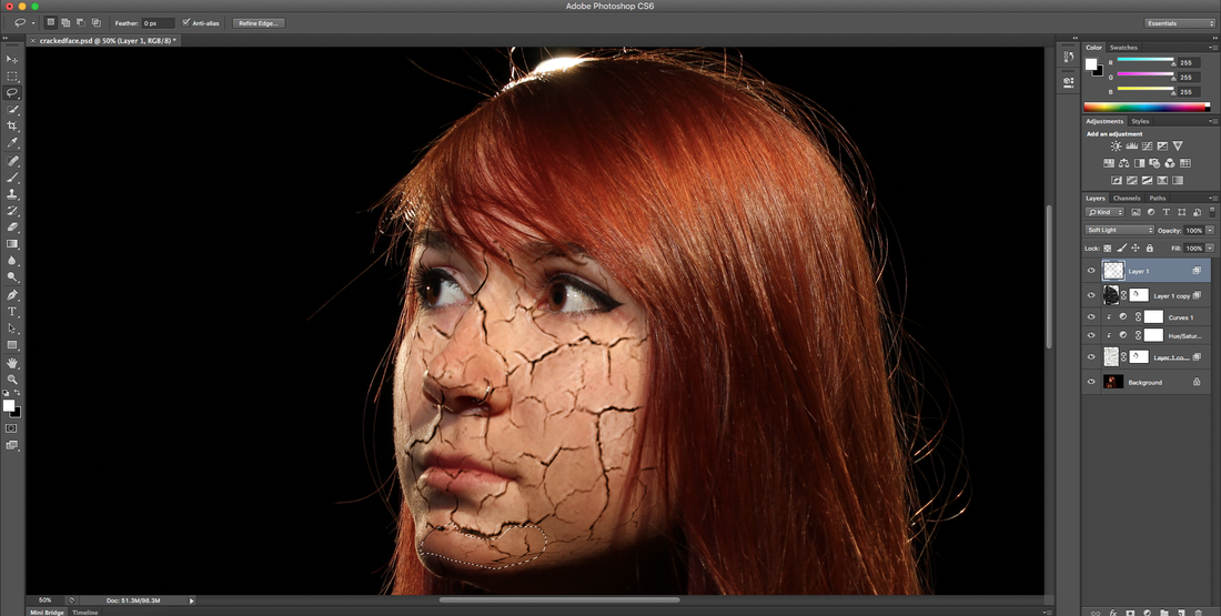
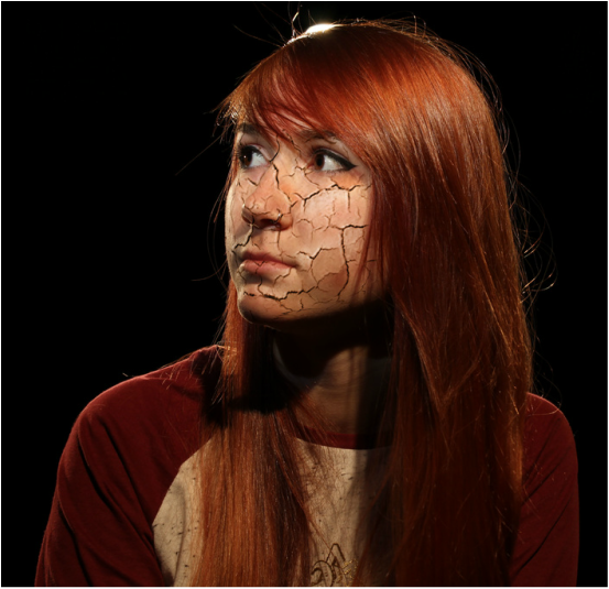
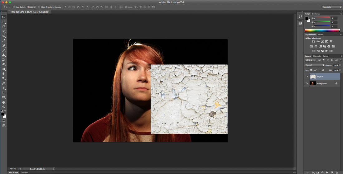
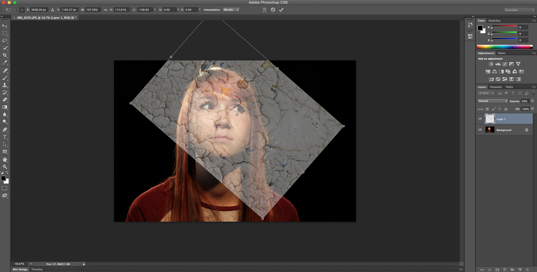
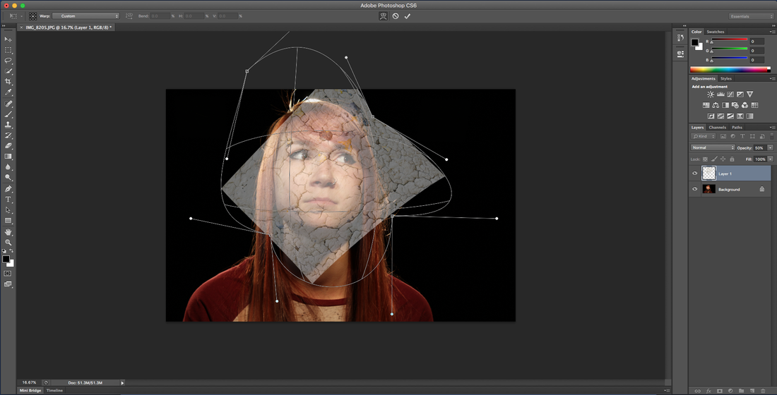
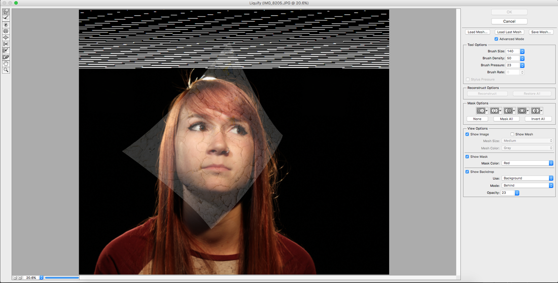
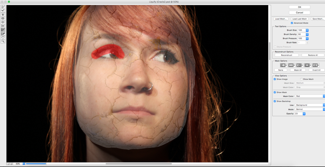
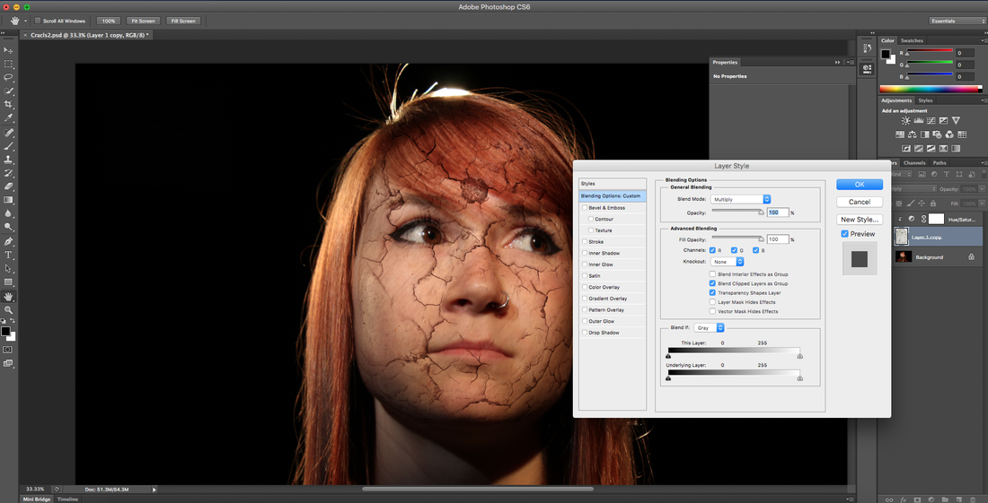
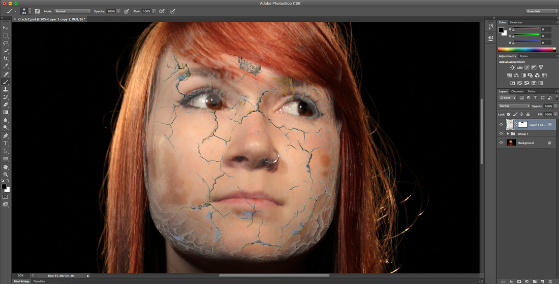
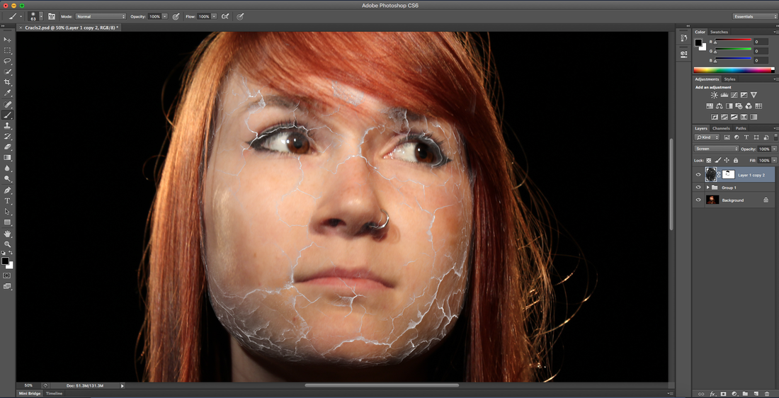
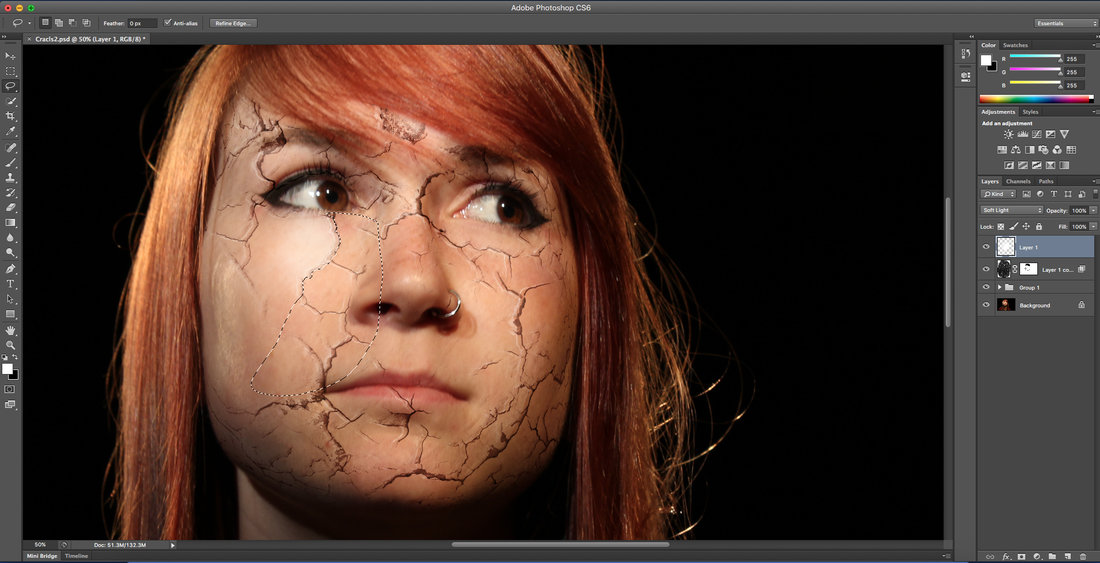
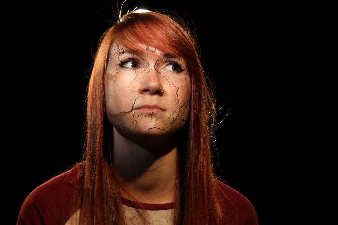
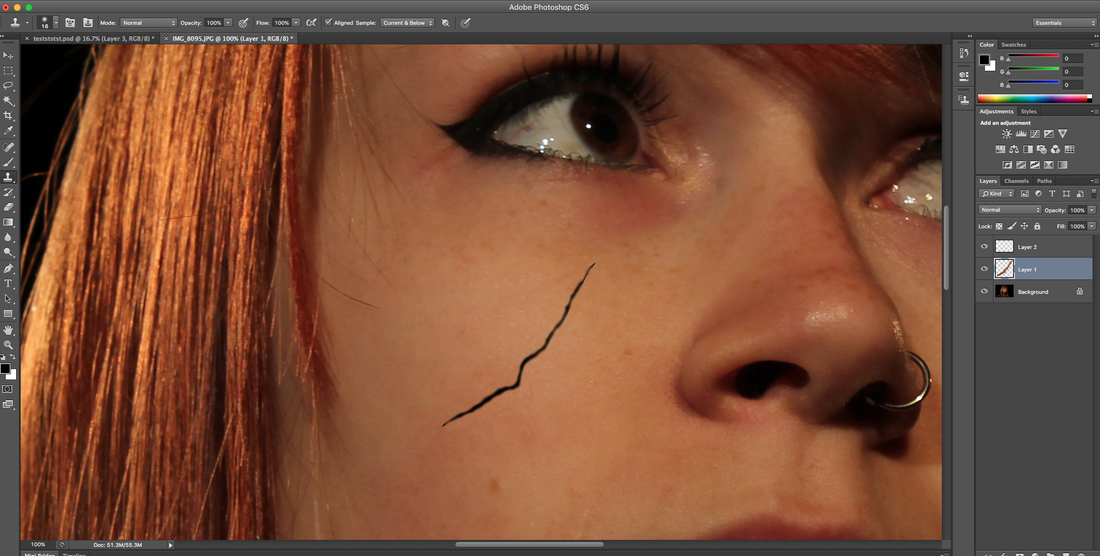
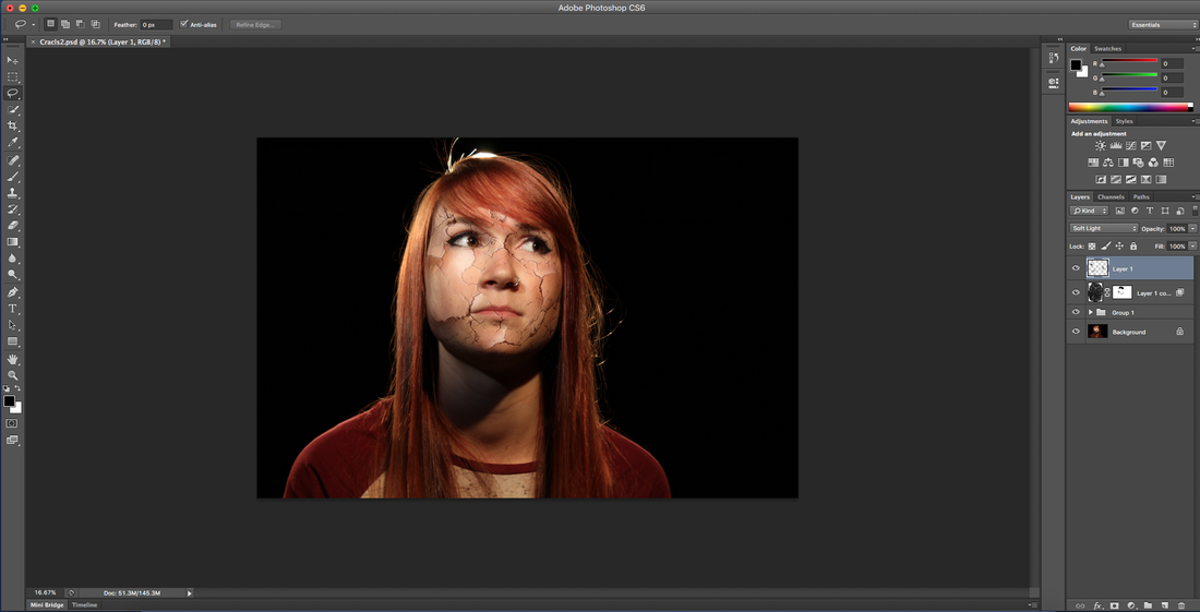
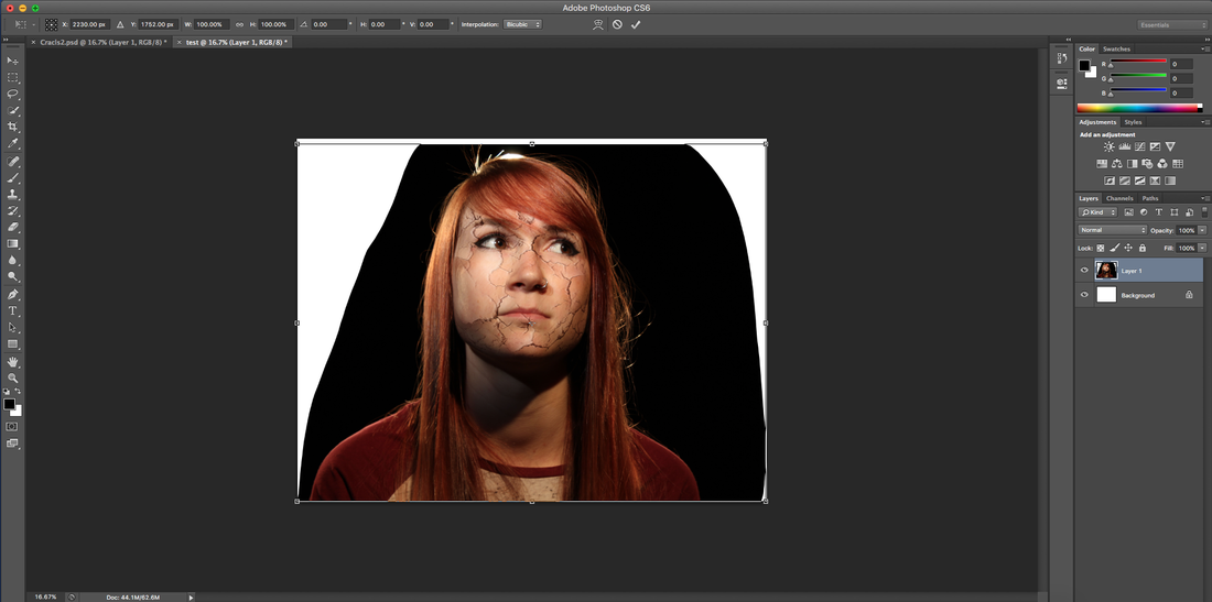
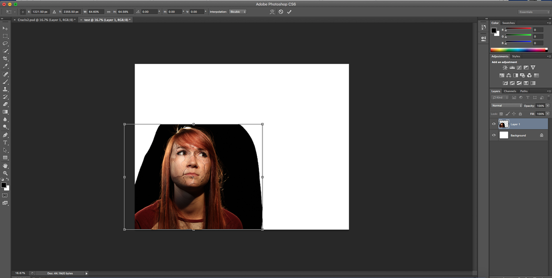
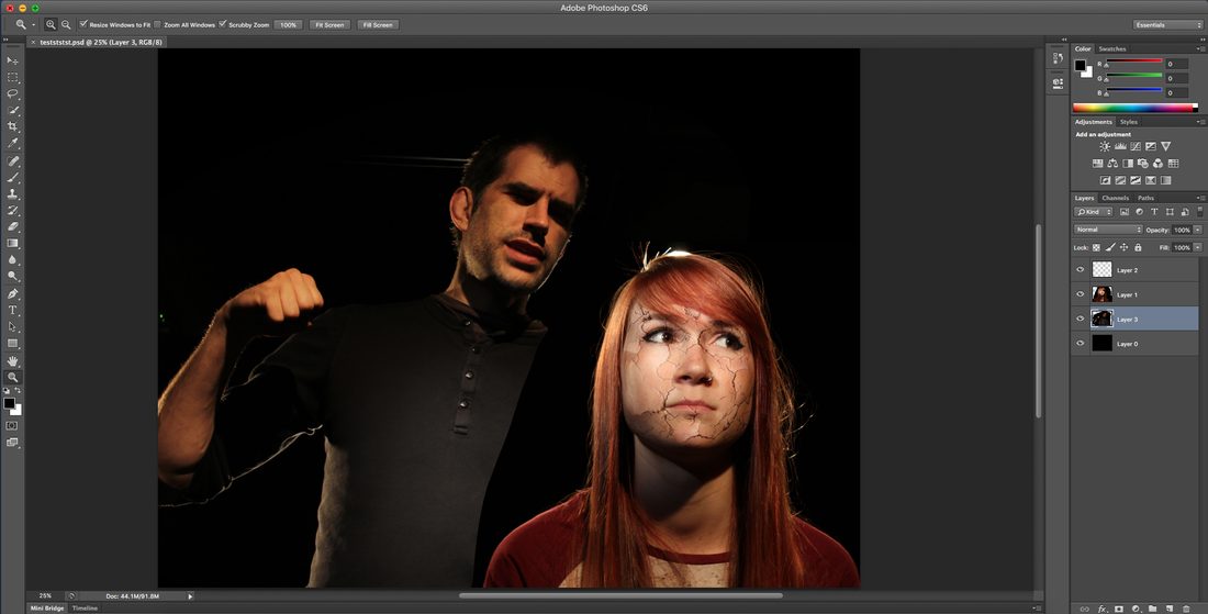
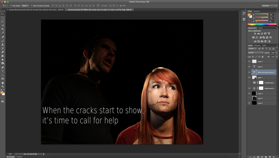
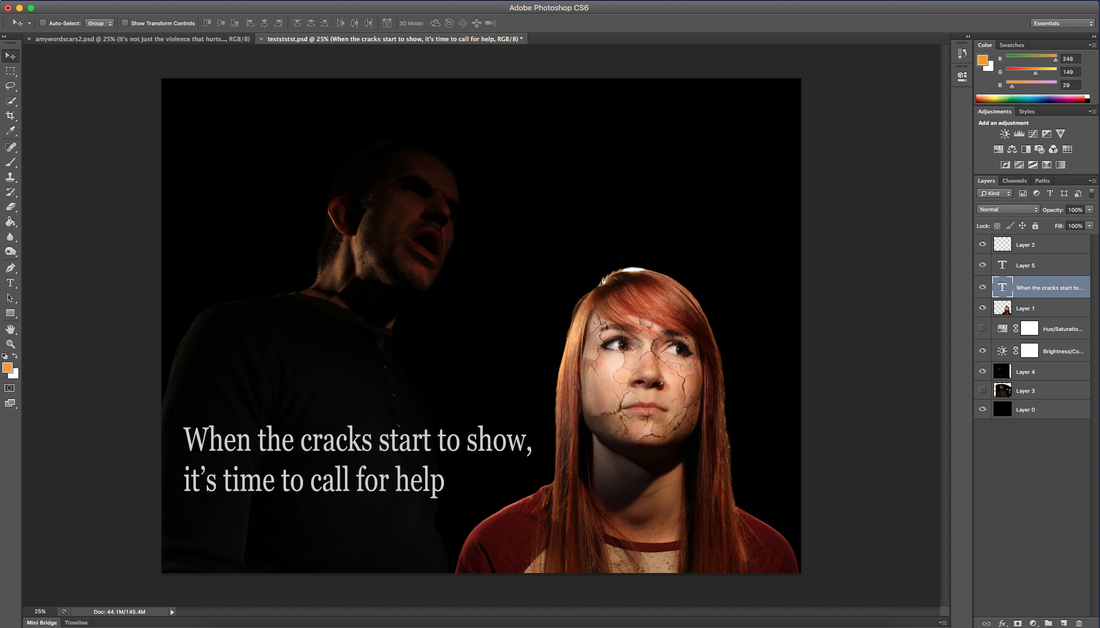
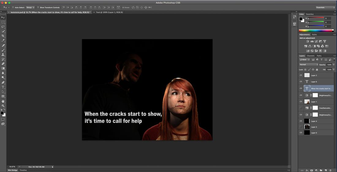
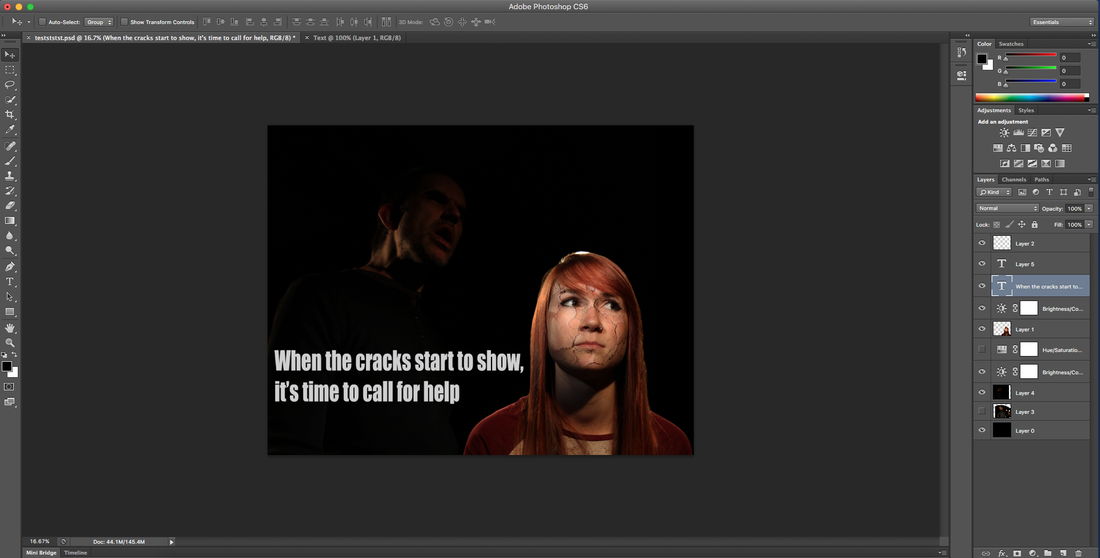
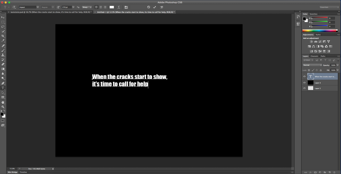
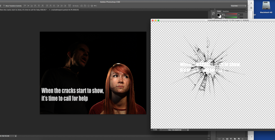
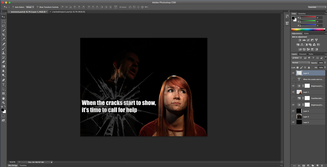
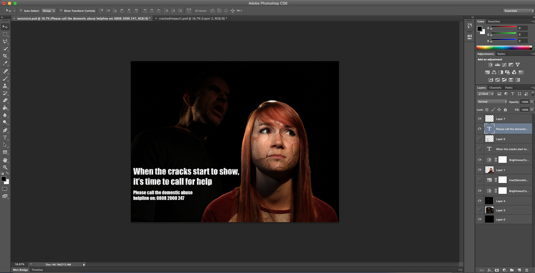
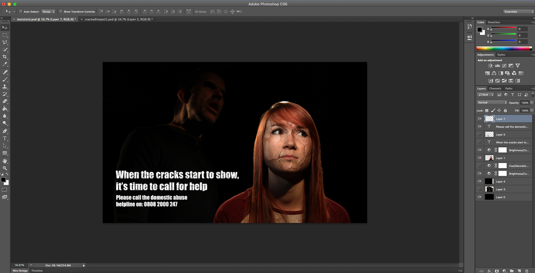
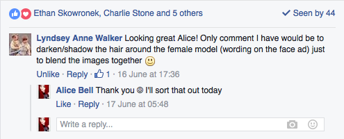
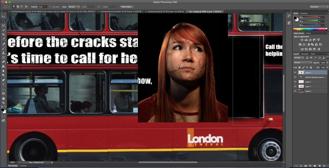
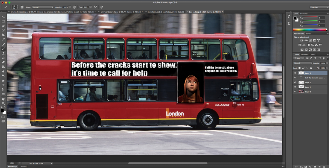
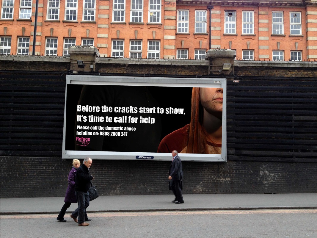
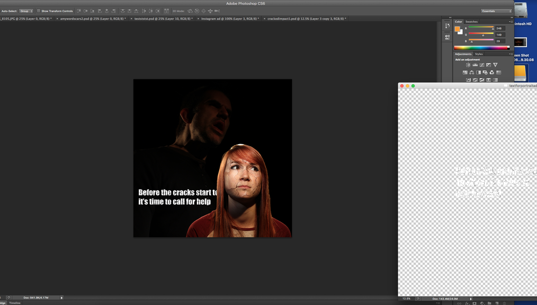
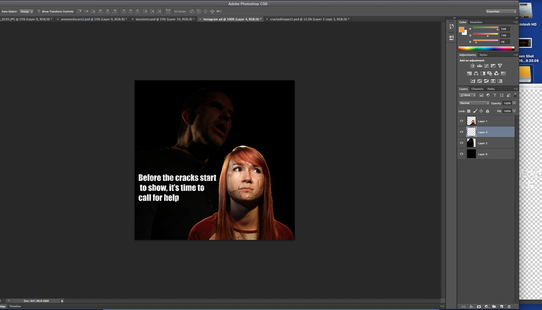
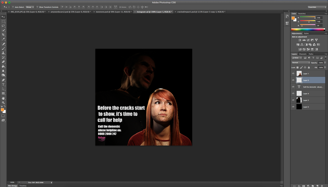
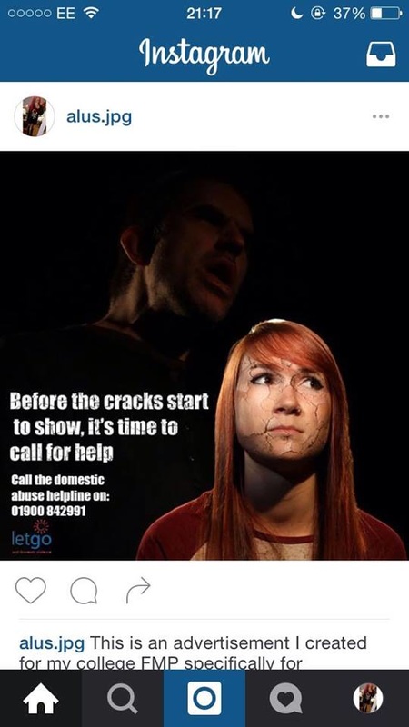
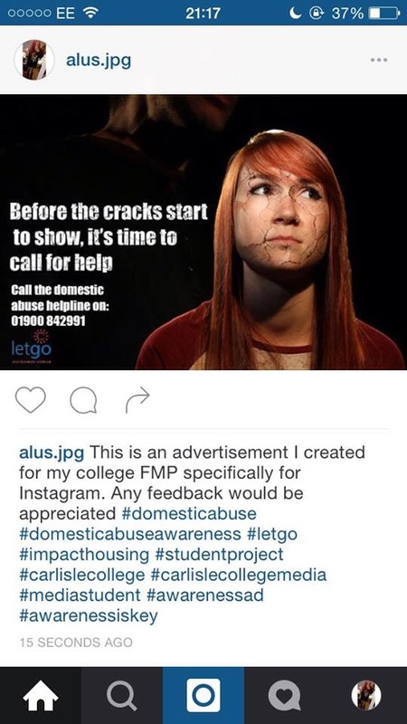
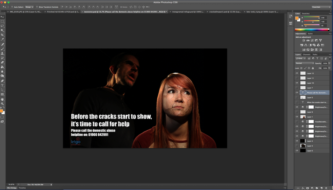
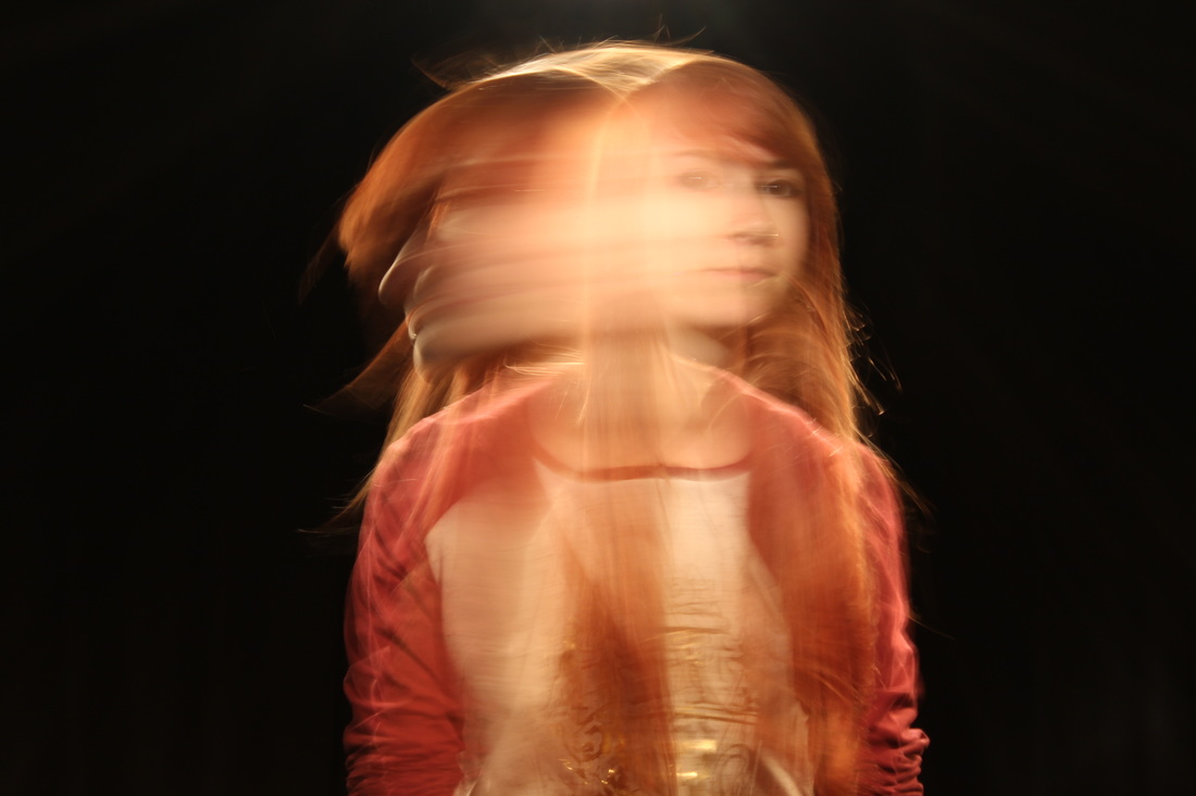
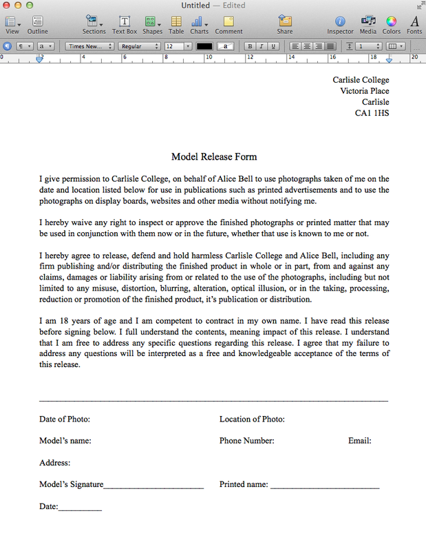
I think that the advertisement at the top with the cracks is my favourite out of the three that I have created. I like how dimensional the cracks look on my models face, and the way I've positioned her in the far right corner looking away from her abuser with a scared expression on her face. I feel that if I had used a different photograph of my model I wouldn't have been able to achieve the same look. I also like the clothes that she's wearing and how the light colour of them contrast with the dark coloured clothing of the abuser. I think the way she is lit makes her look very innocent, which is the exact feel that I was going for.
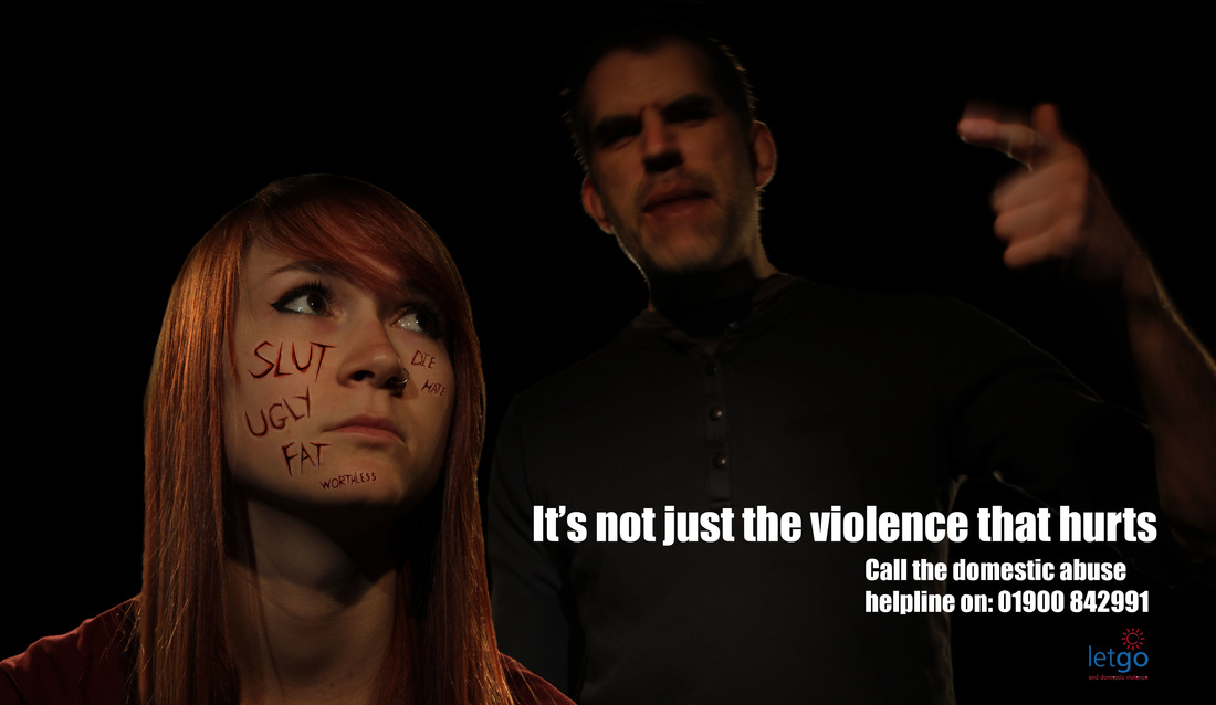
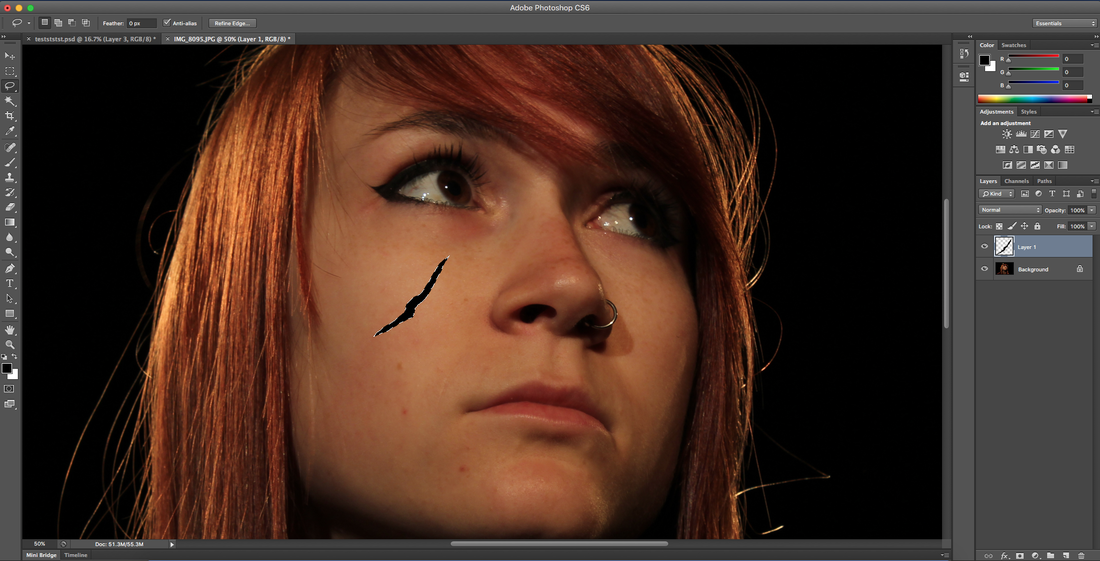
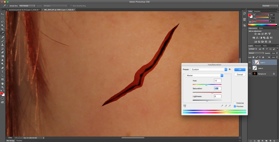
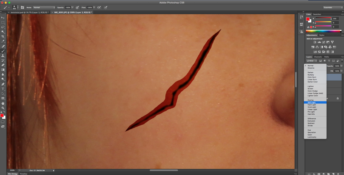
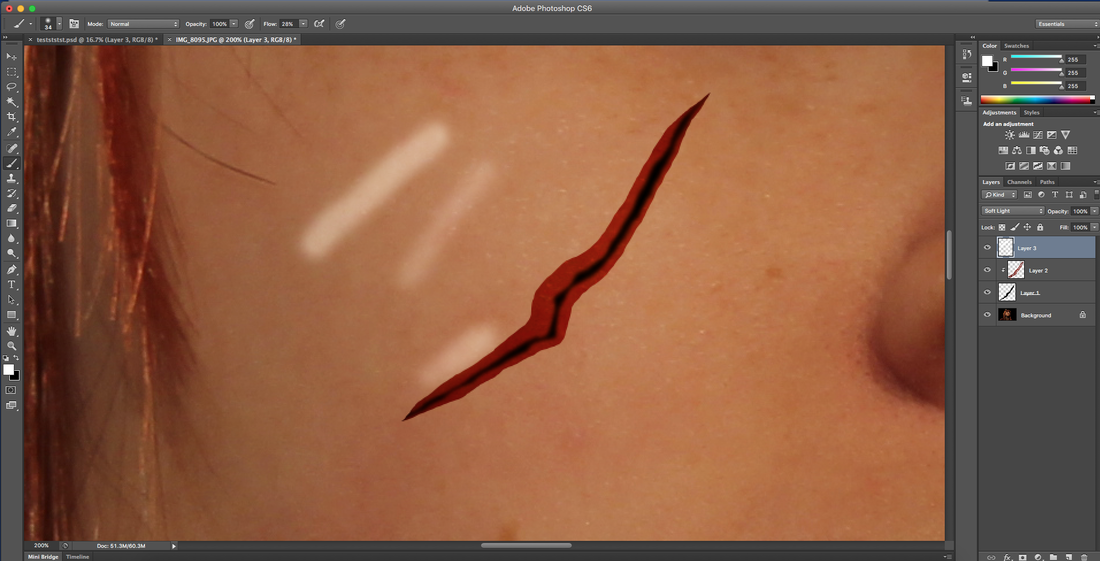
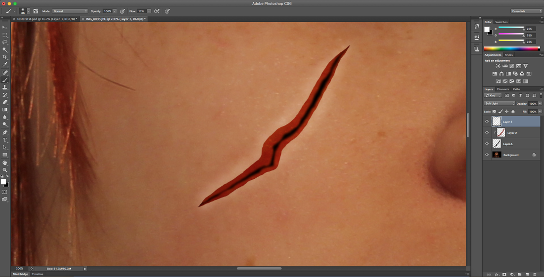
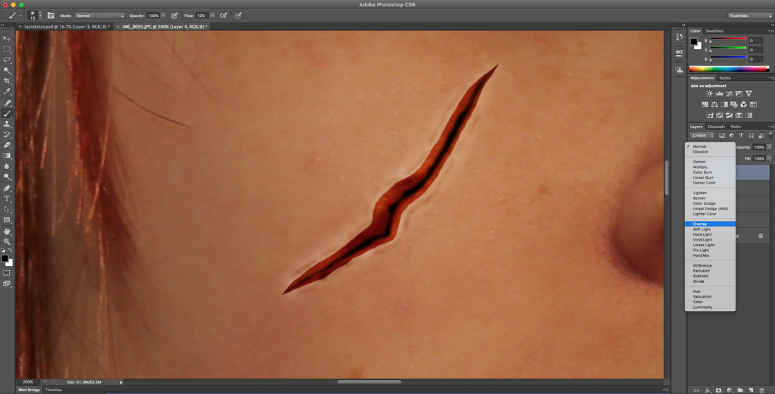
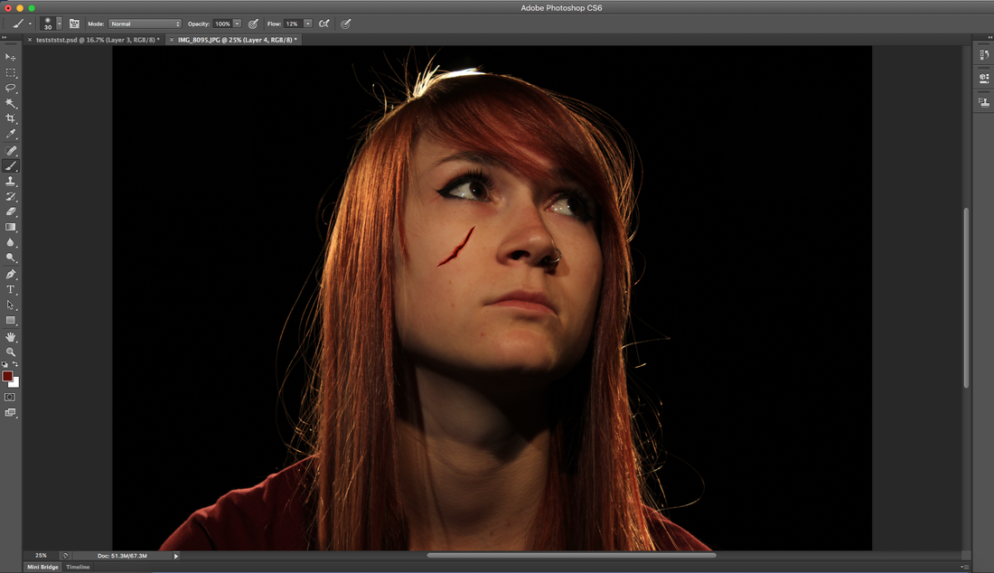
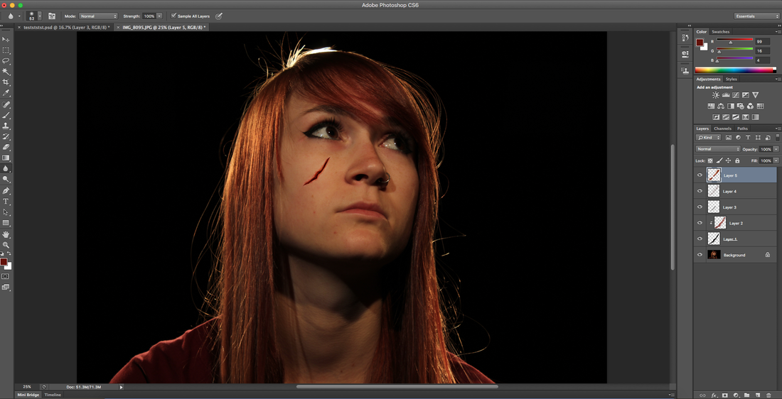
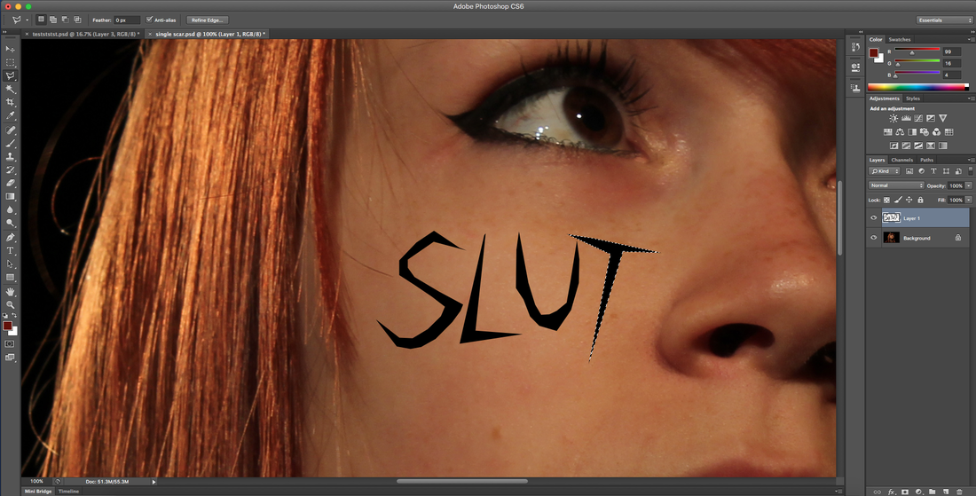
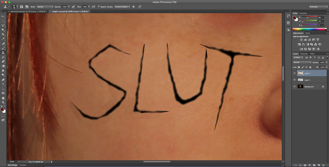
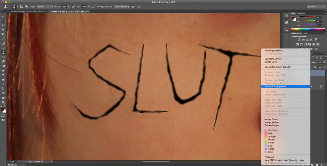
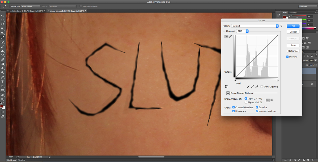
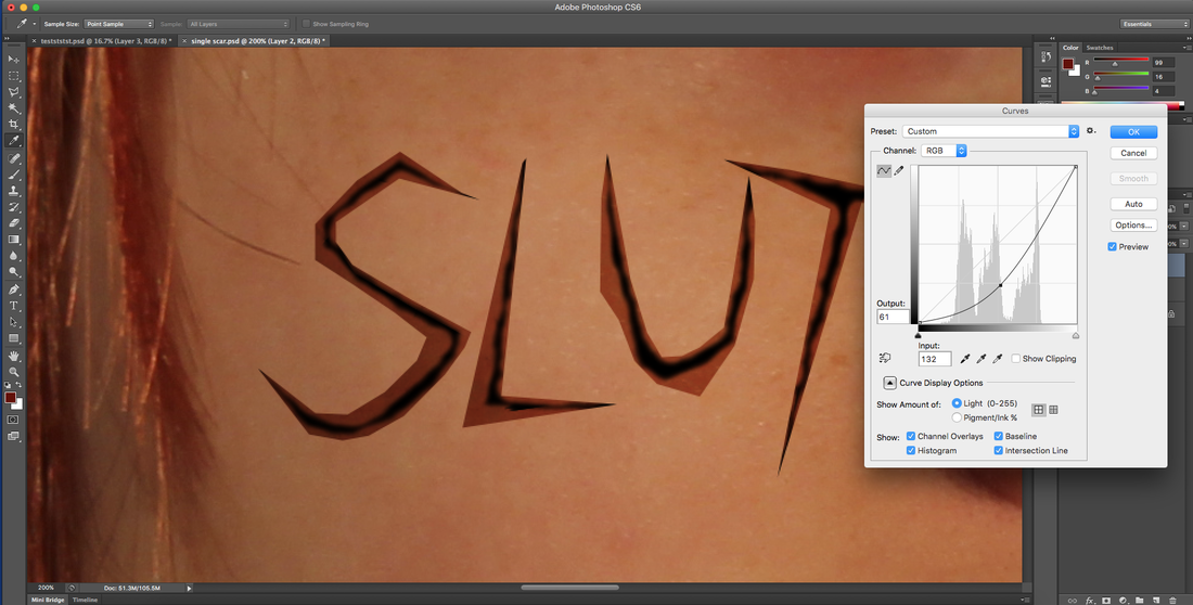
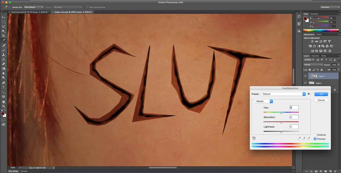
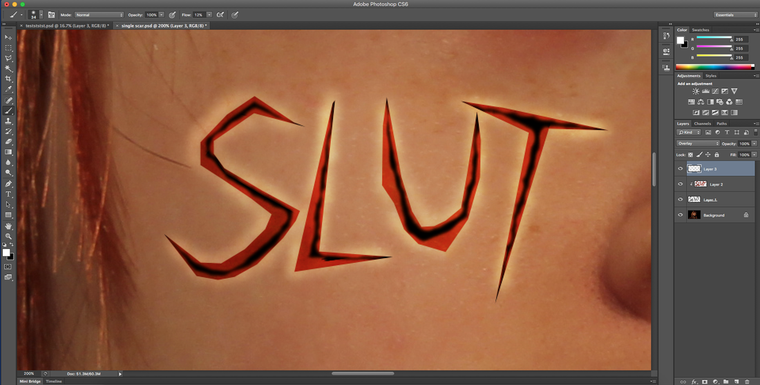
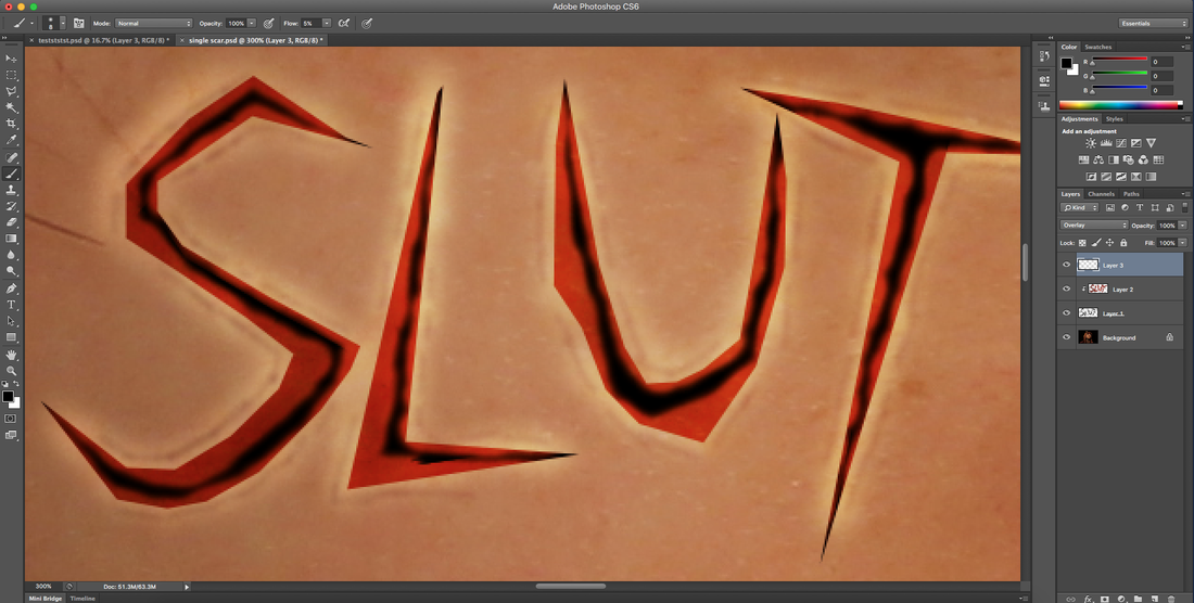
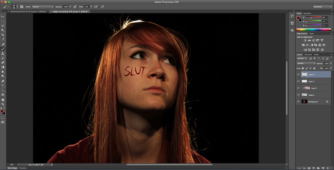
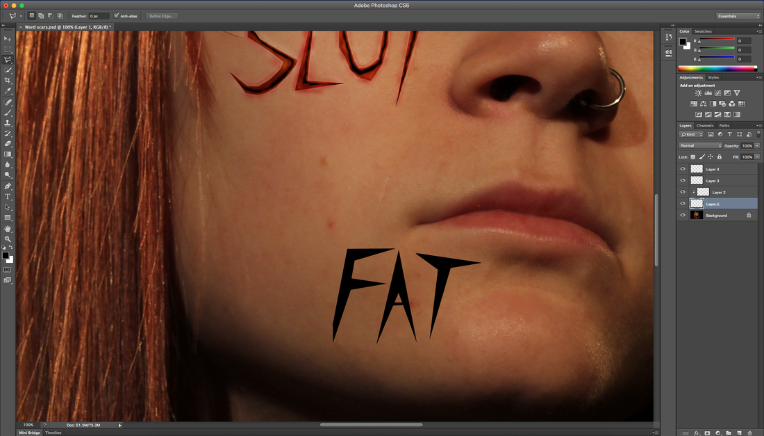
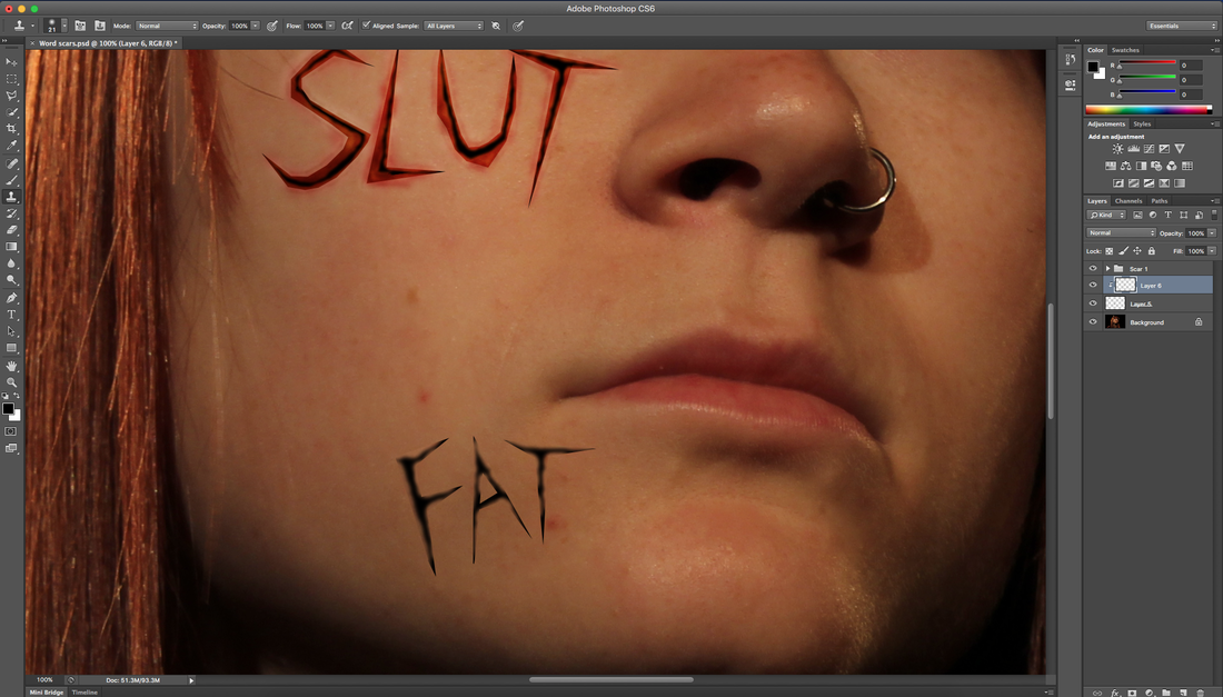
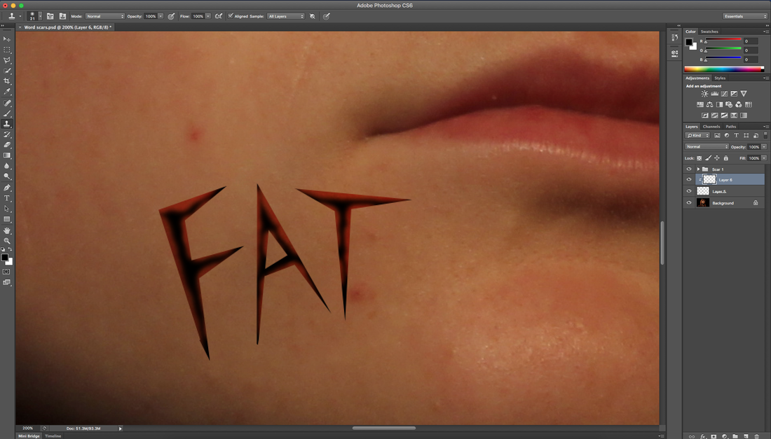
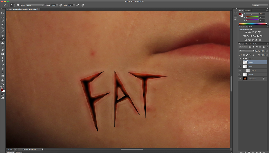
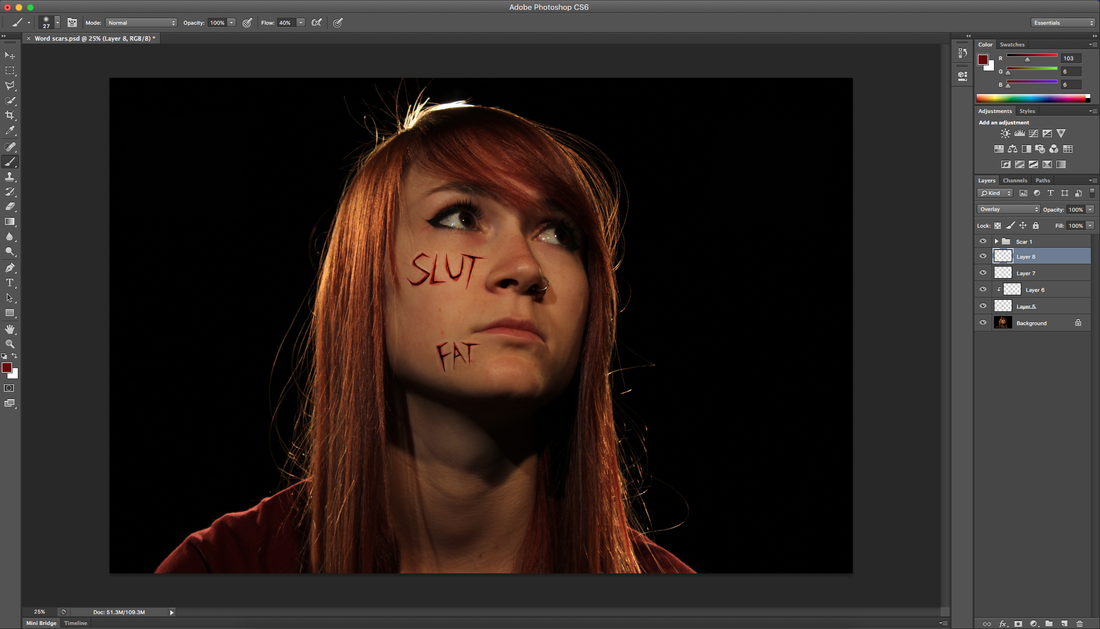
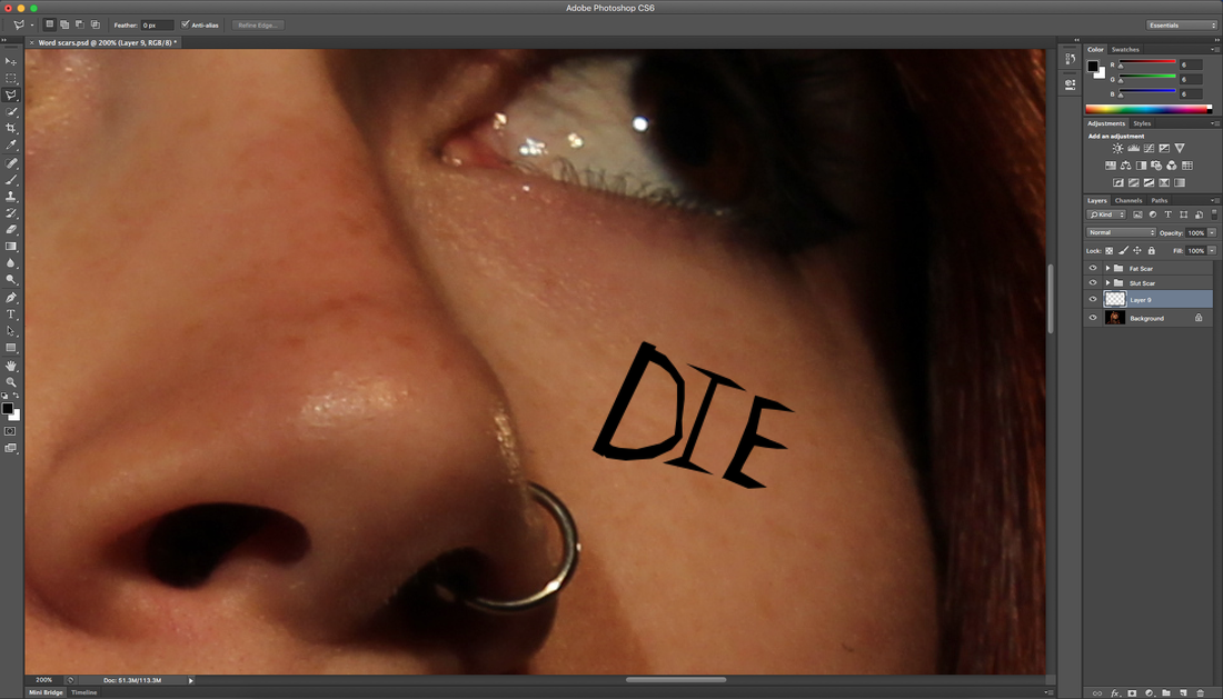
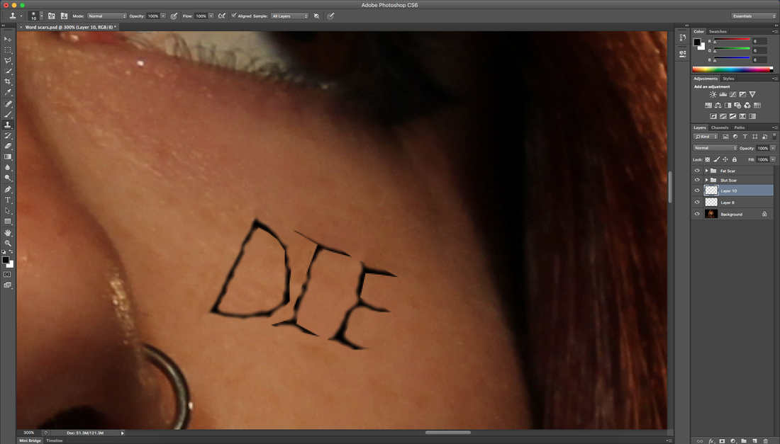
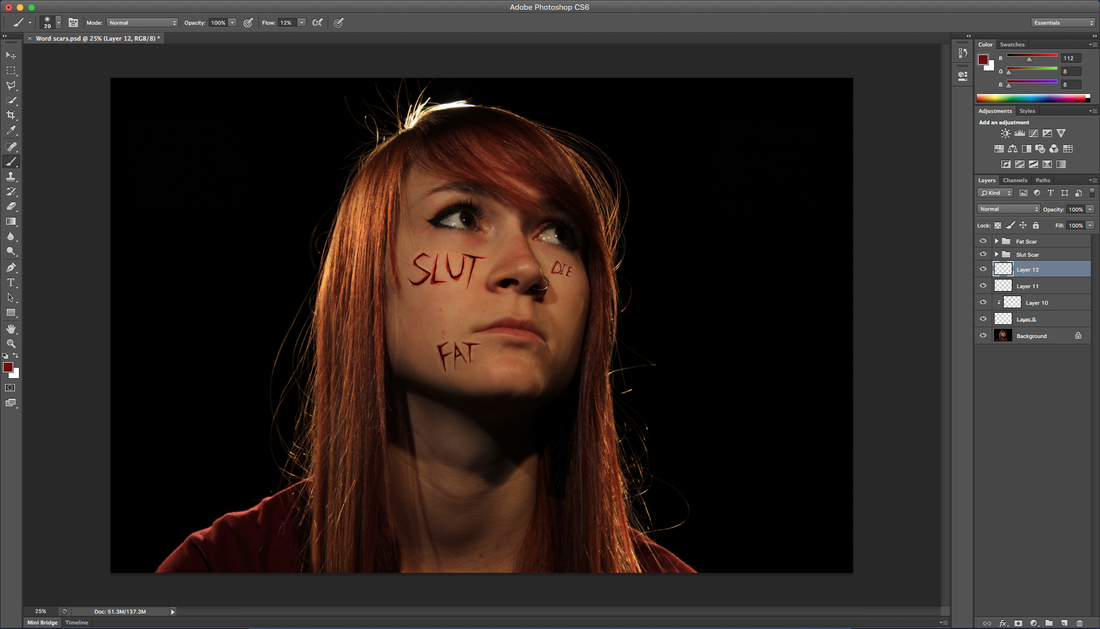
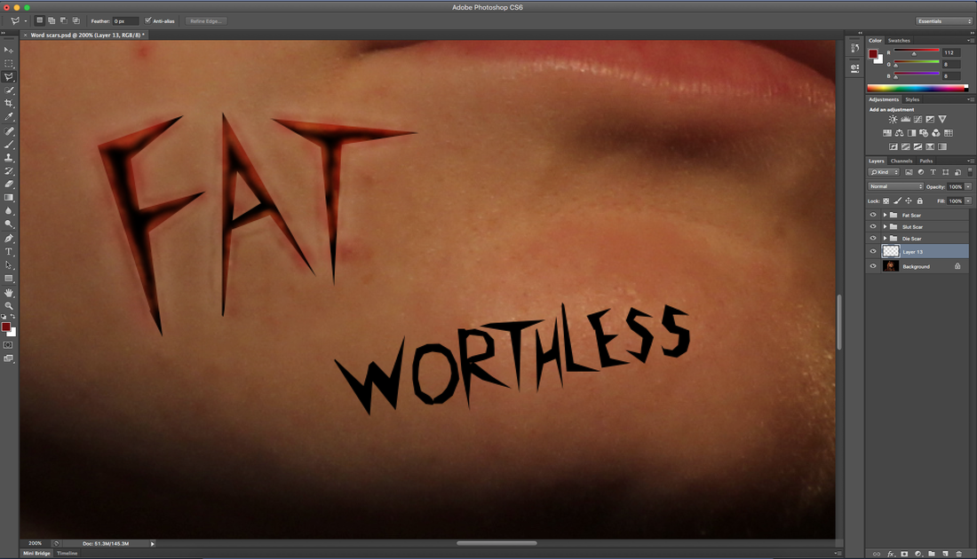
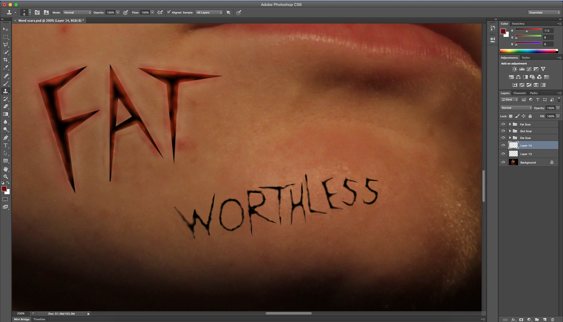
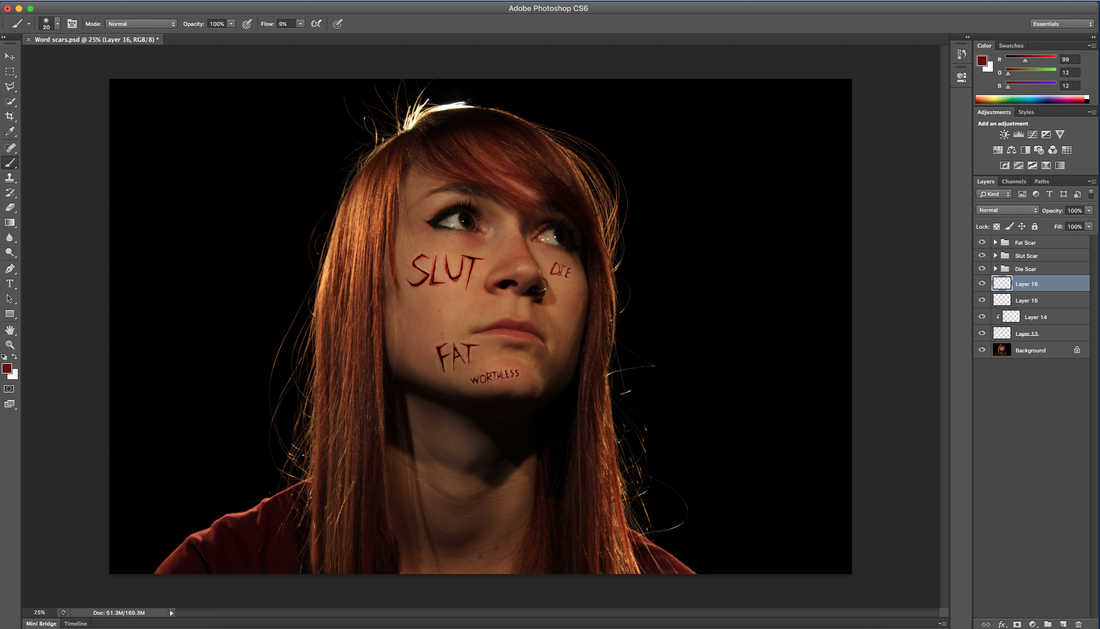
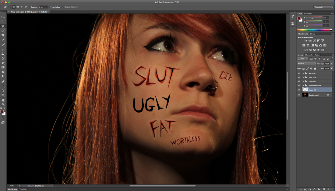
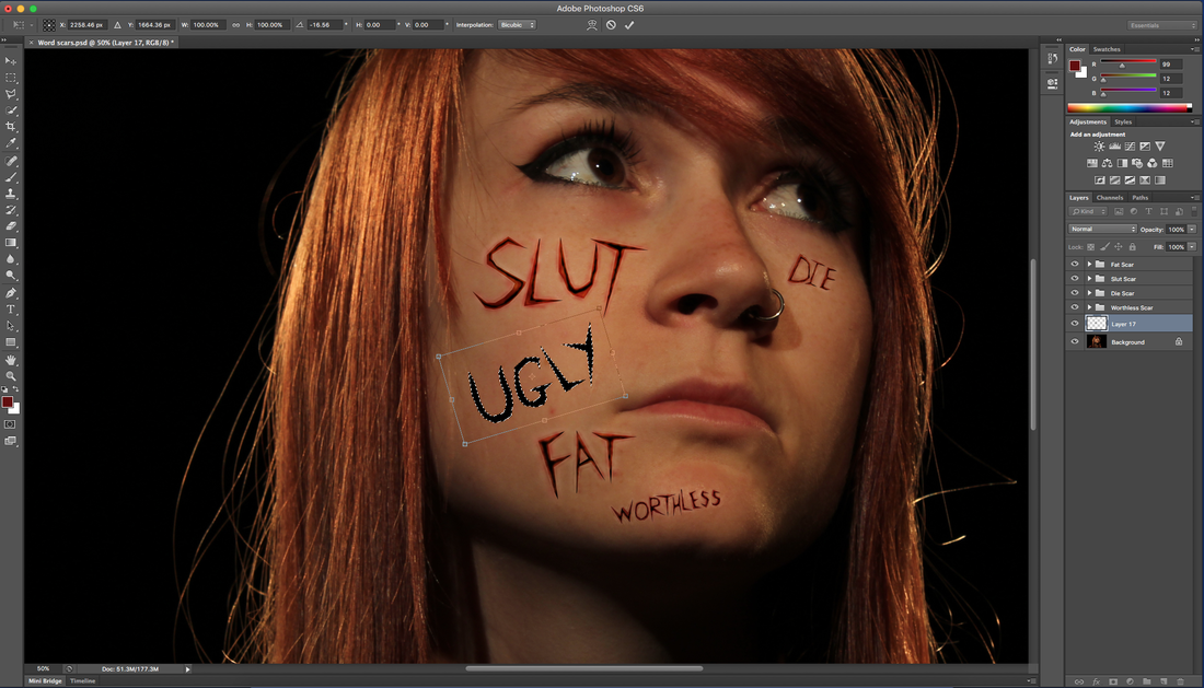
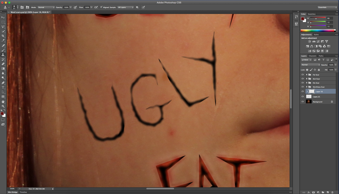
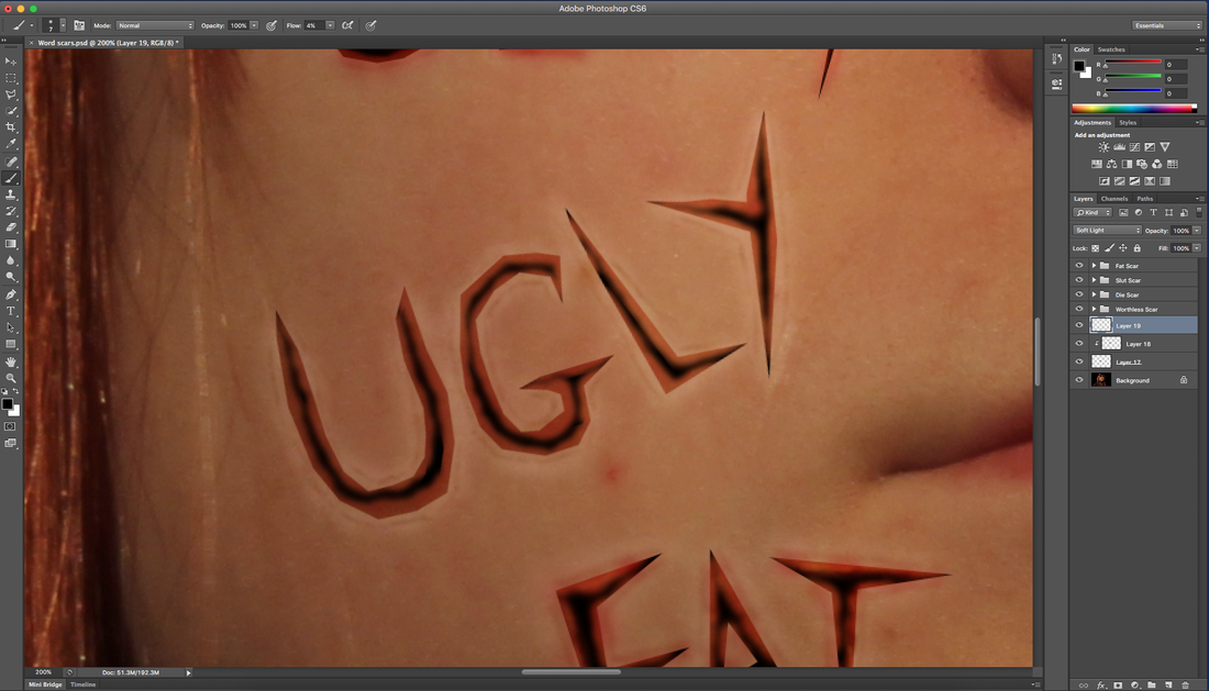
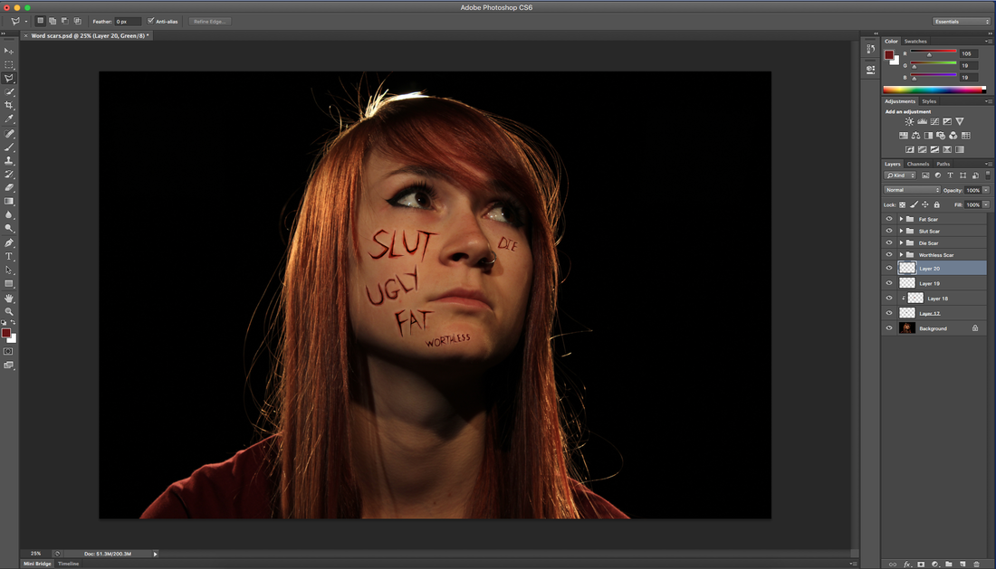
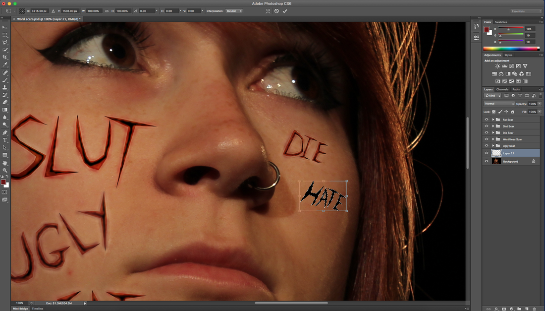
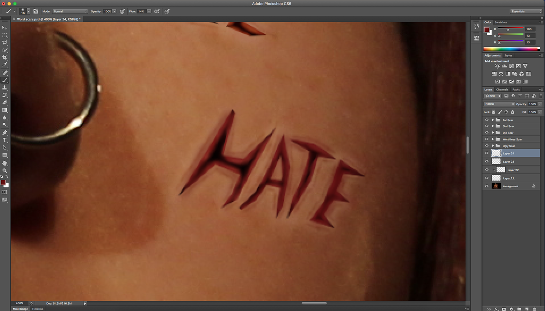
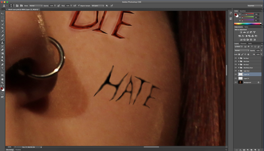
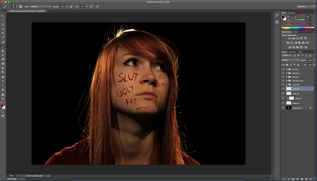
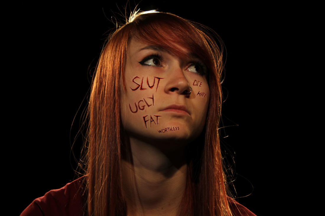
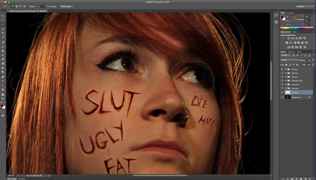
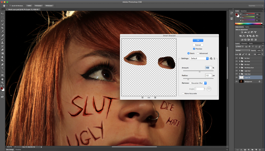
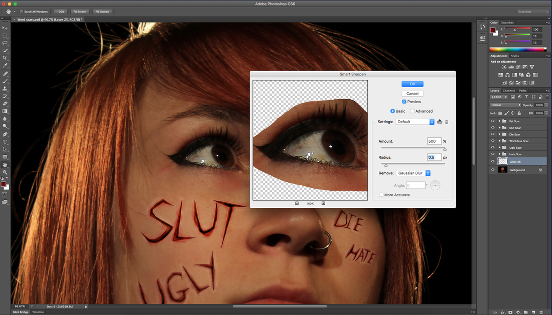
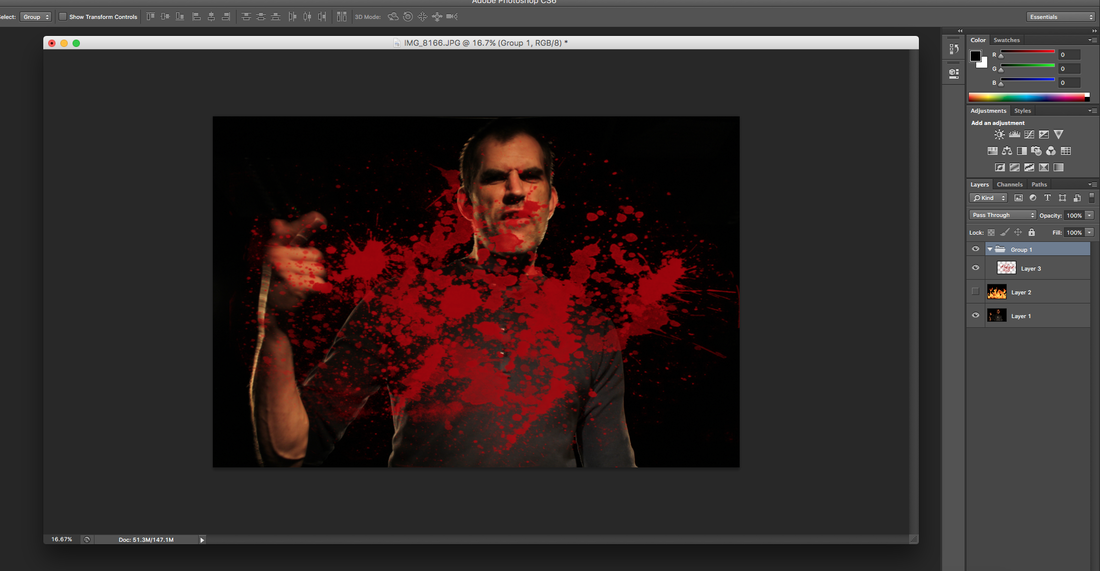
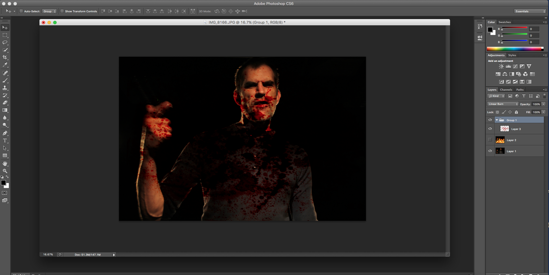
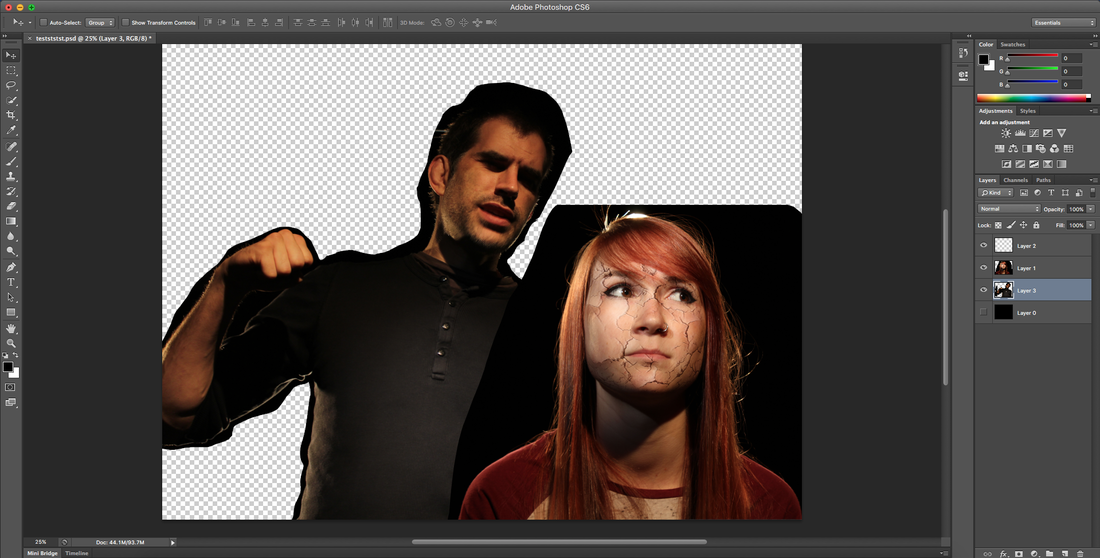
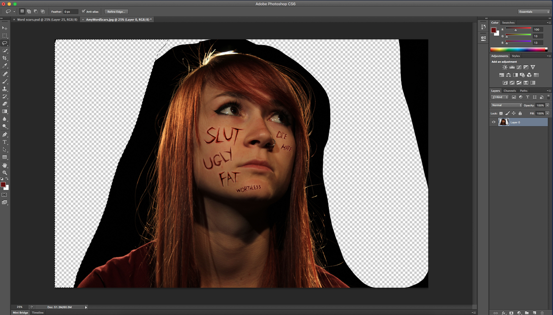
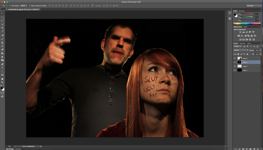
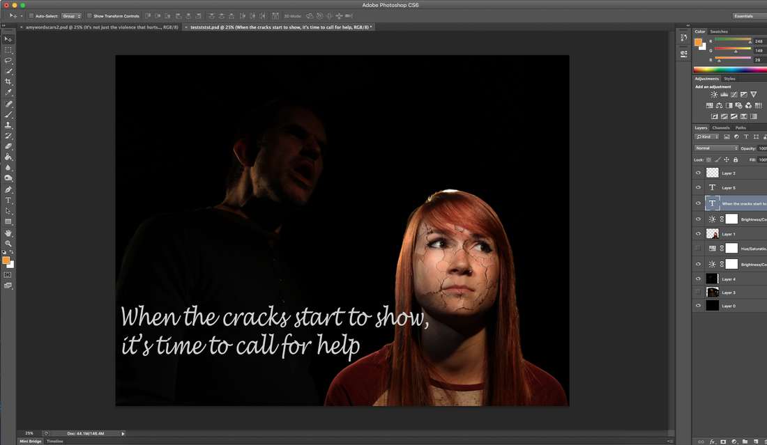
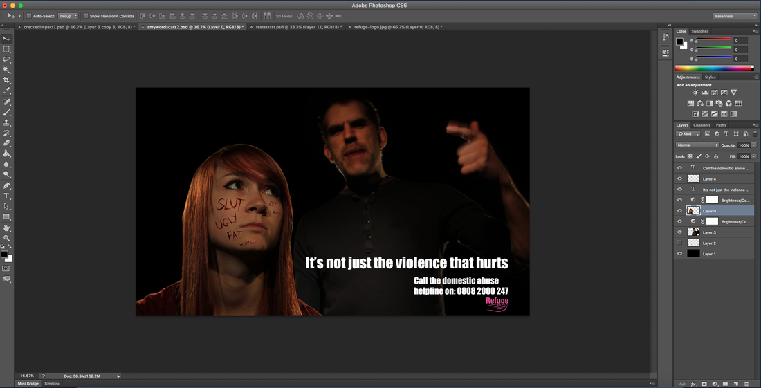
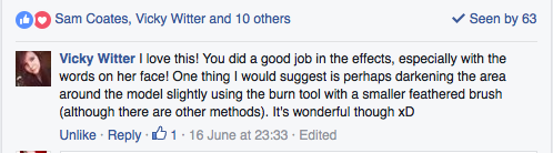
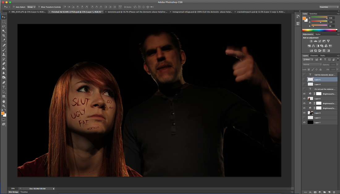
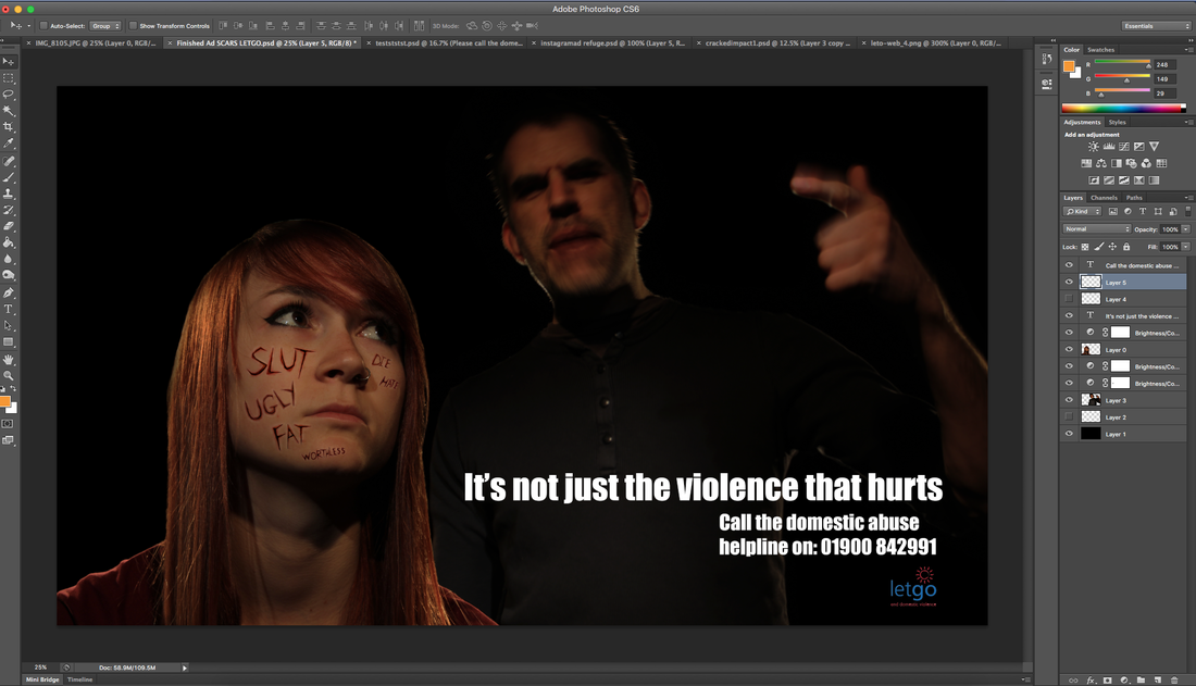
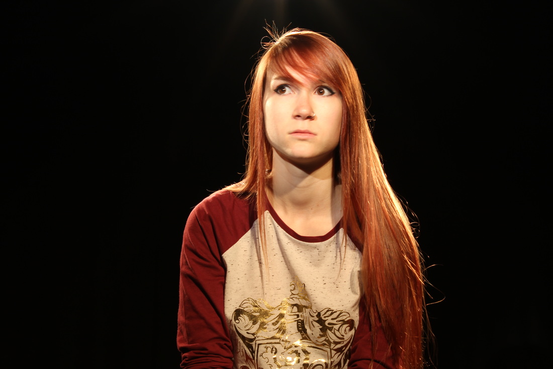
I'm really impressed with my Photoshop work on the word scars ad, as I didn't expect for one second that I would be able to create something like I have. I thought that because I didn't use SFX makeup to create my word scars, I had no chance of being able to make them. I'm really pleased that I stuck with my idea of having words cut into my models skin to represent psychological abuse. I think that my choice of photograph has made all the difference. I like how the angle is slightly underneath her, and the shadows on her are really dark. I like how I've chosen a photograph of my female model where she is looking up, and then the background image of my male model is looking down. I'm pleased with my positioning of my models in the word scars ad, as their eyes are on the same level and you can feel a connection.
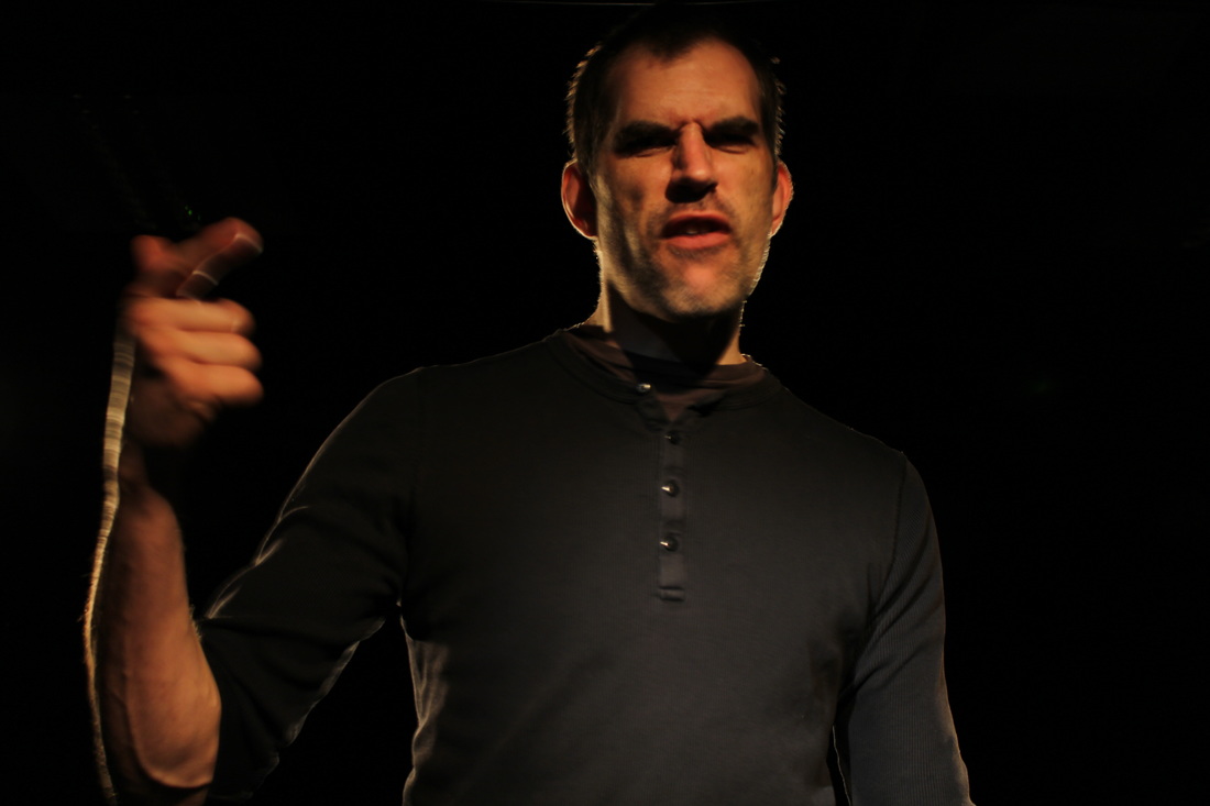
As for the male model in the background of the cracks ad, I feel his facial expression really makes this advert. I could have gone with a photograph of him where he had his fists clenched or something, but I feel that because his arms are down, it helps to blend him into the image better. Personally I really like how dark he is in comparison with the female model. One thing I don't like about the way I've edited the male model is the saturation, however this kind of worked in my favour as his face looks a little red as though he is angry and shouting.
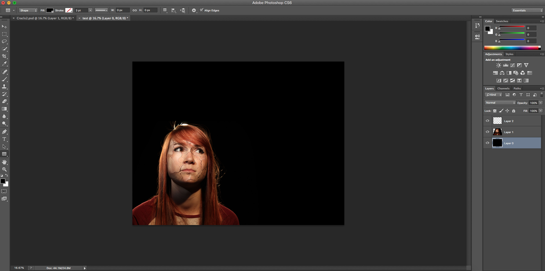
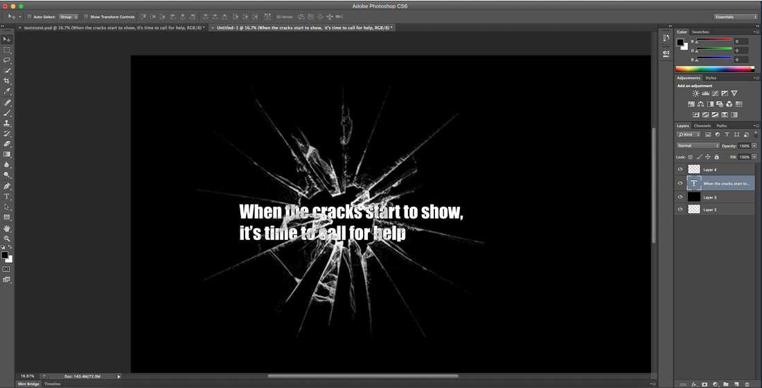
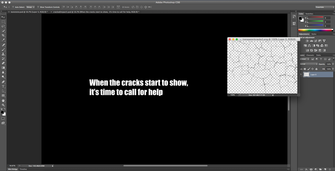
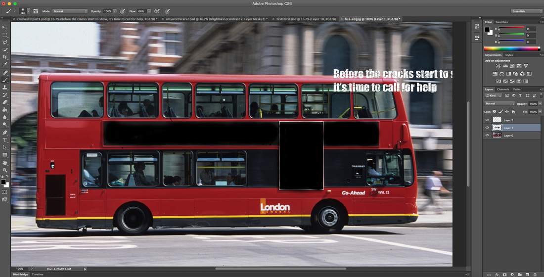
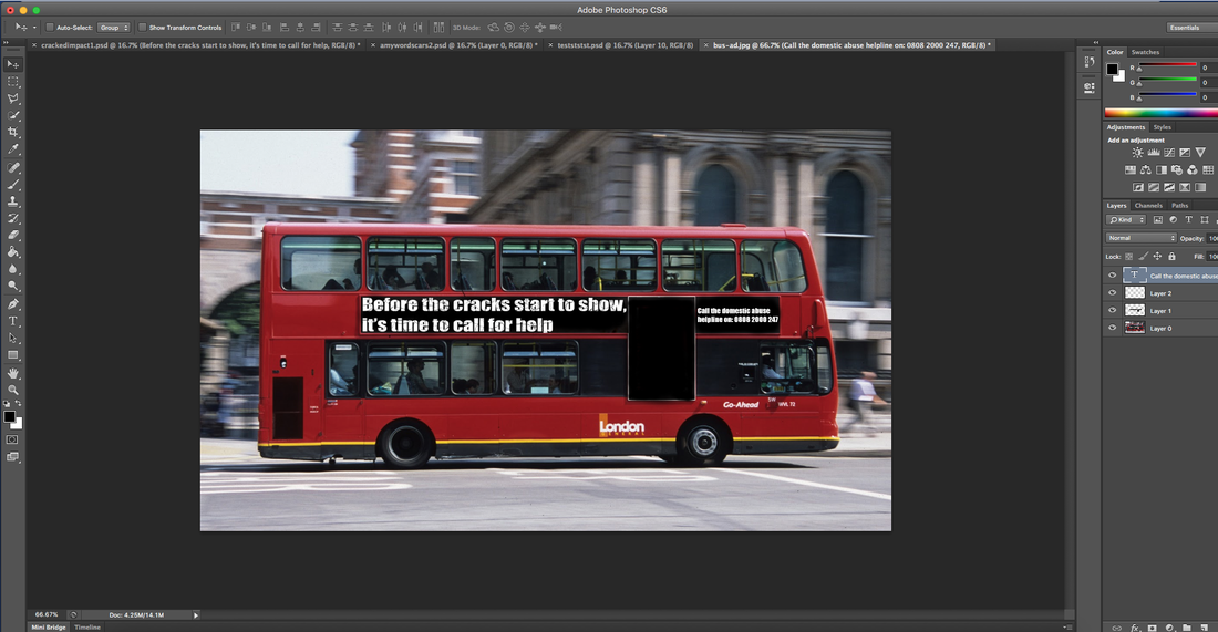
The positioning of my text works well on my cracked ad. It says what I want it to and it isn't taking up too much of the image, so I think I've positioned it well. I like the subtle cracks in the main text that almost match the cracks on my models face. The cracks matching the cracks on my models face wasn't intentional, but I'm very happy with how it looks. I'm not very happy with the white parts of the logo that I forgot to remove, but this isn't very noticeable from afar.
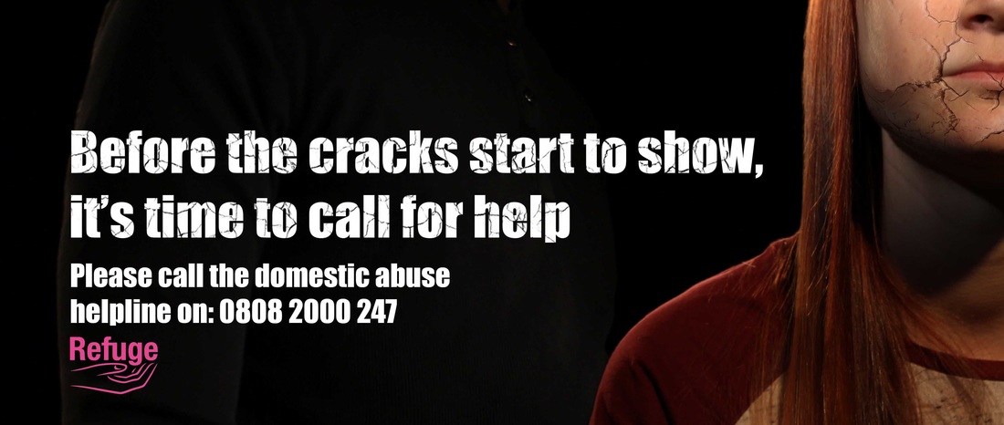
After placing my ads into a domestic environment, I am confident that they are sucessful ads.
As for my word scars advertisement, I think the positioning of my text is even more effective than the scars one as we read from left to right, so you see the female model with the abuse written allover her face first, then you see the text (the explanation as to why she has words cut into her skin) and then you see the male model (the cause of the abuse victim's scars). This was intentional, and I'm pleased that I spent a lot of time carefully thinking about the positioning of my text. It may seem like a minor thing, but it has really improved the effectiveness of my advert.
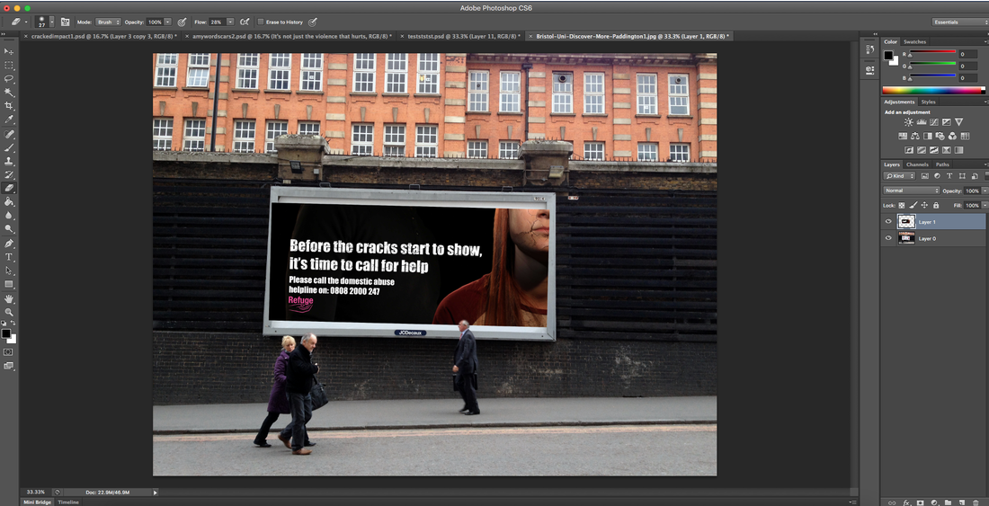
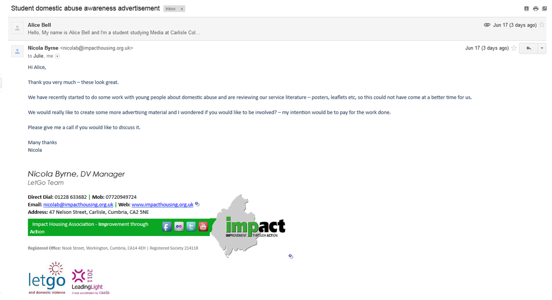
Overall I'm very pleased with my finished project, and all the research I did into domestic abuse, photography and advertisements have helped to shape my project into what it is today. I'm happy that I did the two extra ads for Instagram and a bilboard as they have helped me to demonstrate that I can take the same ad and use it for different purposes. I think the best thing that has come out of doing my project is definitely the offer from the Let Go charity for me to create some more ads for them. I really wasn't expecting that and I'm completely over the moon to have such an offer. It really makes me feel as though all my hard work has paid off.
I think that if I'd have had more time to do this project I would have definitely have created more ads and tried out some more photoshop techniques. I would have really liked to have tried doing some adverts that were set in a domestic environment, as I feel that would have created a stronger emotional link between the viewer and the advertisement, as during my research I found that juxtapositions were most effective in printed ads. If I had done the face scars on a photograph in a domestic environment I would have quickly created a very effective juxtaposition, and I'm kicking myself a little bit that I didn't do that.
I'm really impressed with my Photoshop work on the word scars ad, as I didn't expect for one second that I would be able to create something like I have. I thought that because I didn't use SFX makeup to create my word scars, I had no chance of being able to make them. I'm really pleased that I stuck with my idea of having words cut into my models skin to represent psychological abuse. I think that my choice of photograph has made all the difference. I like how the angle is slightly underneath her, and the shadows on her are really dark. I like how I've chosen a photograph of my female model where she is looking up, and then the background image of my male model is looking down. I'm pleased with my positioning of my models in the word scars ad, as their eyes are on the same level and you can feel a connection.
As for the male model in the background of the cracks ad, I feel his facial expression really makes this advert. I could have gone with a photograph of him where he had his fists clenched or something, but I feel that because his arms are down, it helps to blend him into the image better. Personally I really like how dark he is in comparison with the female model. One thing I don't like about the way I've edited the male model is the saturation, however this kind of worked in my favour as his face looks a little red as though he is angry and shouting.
The positioning of my text works well on my cracked ad. It says what I want it to and it isn't taking up too much of the image, so I think I've positioned it well. I like the subtle cracks in the main text that almost match the cracks on my models face. The cracks matching the cracks on my models face wasn't intentional, but I'm very happy with how it looks. I'm not very happy with the white parts of the logo that I forgot to remove, but this isn't very noticeable from afar.
After placing my ads into a domestic environment, I am confident that they are sucessful ads.
As for my word scars advertisement, I think the positioning of my text is even more effective than the scars one as we read from left to right, so you see the female model with the abuse written allover her face first, then you see the text (the explanation as to why she has words cut into her skin) and then you see the male model (the cause of the abuse victim's scars). This was intentional, and I'm pleased that I spent a lot of time carefully thinking about the positioning of my text. It may seem like a minor thing, but it has really improved the effectiveness of my advert.
Overall I'm very pleased with my finished project, and all the research I did into domestic abuse, photography and advertisements have helped to shape my project into what it is today. I'm happy that I did the two extra ads for Instagram and a bilboard as they have helped me to demonstrate that I can take the same ad and use it for different purposes. I think the best thing that has come out of doing my project is definitely the offer from the Let Go charity for me to create some more ads for them. I really wasn't expecting that and I'm completely over the moon to have such an offer. It really makes me feel as though all my hard work has paid off.
I think that if I'd have had more time to do this project I would have definitely have created more ads and tried out some more photoshop techniques. I would have really liked to have tried doing some adverts that were set in a domestic environment, as I feel that would have created a stronger emotional link between the viewer and the advertisement, as during my research I found that juxtapositions were most effective in printed ads. If I had done the face scars on a photograph in a domestic environment I would have quickly created a very effective juxtaposition, and I'm kicking myself a little bit that I didn't do that.
Distributing my ads at college
Below is a video to show my printed advertisements in action. I stuck them up around college in both the main building and the arts building. Unfortunately I was only able to record my ads in the art building, but I stuck them up where ever I could!


 RSS Feed
